[Photoshop] Assasins Creed Sig
- Thread starter Pesh
- Start date
More options
Who Replied?


Awards


Lolz...have u eva heard of clipping mask,C4Ds,brushes and filters,mr smartass?u giv ur critique, i give mine. personally, you critique is s**t, and only makes sigd liik like urs.
what tool would that be?
lolz :dIt looks good to me O_O
*looks at people argueing*
yeah so 7/10

Awards
yes, and i use many of those in my sigs.Lolz...have u eva heard of clipping mask,C4Ds,brushes and filters,mr smartass?
my point is that YOU only used the smudge tool

Oh god! I've said this one million times, I don't want people's sigs to look like mine, I'm not soo stupid to think like that, at least, my crtique is reasonable and shows sense, you in critique either say: you smudged! or: you overblurred!
you only comment like that because you're taking these things personally
You just hate us because we don't fit your ''taste''
so I'm gonna say it for once, for once in your live, please!! be reasonable and stop taking every word I say personally -___-
Wow, straight up, you, and UchihaObito made this personal, NG stated what he thought about the sig, and you two lashed out at him for it, when NG said to soften the letters, he was referring to the fact that they stand out too much, they stand out more than the render.
i'm not going to mention your work Khaled cause from what you've said here it's obvious that you'll never take any criticism seriously, despite the fact that you dish it out to everyone, even people better than yourself.
UchihaObito on the other hand, i will mention yours. My first major problem, is that your work is pretty much a clone of what Khaled does, sure, it looks good, i'm not gonna deny that, but there is, as NG said, no creativity, everything you make, sticks to a style using the same techniques, there is nothing new or interesting, your not challenging yourself, your just sticking within your comfort zone.

Celestial Sanctuary
Member
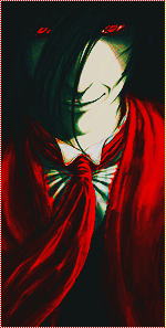
Well if you want an honest critique, I'll give it to you. If not move on to the next post.You must be registered for see images
duh?
CnC please
And khaled I already heard urs please dont post here
-Floating Head Syndrome...bad.
-Clipping mask next to his head doesn't fit at all. Just looks like a randomly placed blob.
-Over sharpened in all the wrong places. When doing a smudge tag you want to sharpen, dodge, and burn on the smudging in different areas on different layers to create depth.
-Erase sharpening around the face and such where it looks pixilated. (Makes it look low quality)
-Always remember that the foreground should be detailed and the background less so, you have it backwards here. Slight blur in places around the background, and detailing in the front would be amazing.
-Text, as pointed out is sorry to say, not good.
-To end, I actually really like the lighting here. It's not the dumb white soft brush everyone keeps using (At least you used the blending options instead of leavig a white circle). Unlike others I'd say the lighting a strong point here, and in my opinion the highlight of it.
If you go to any legitimate sig making forums, you get the same comments I just gave. They'll be less specific of course. I tried to point out exactly where the problem was and how to fix it. Hope this helps.
Awards
thank you kiltz, and i agree.Wow, straight up, you, and UchihaObito made this personal, NG stated what he thought about the sig, and you two lashed out at him for it, when NG said to soften the letters, he was referring to the fact that they stand out too much, they stand out more than the render.
i'm not going to mention your work Khaled cause from what you've said here it's obvious that you'll never take any criticism seriously, despite the fact that you dish it out to everyone, even people better than yourself.
UchihaObito on the other hand, i will mention yours. My first major problem, is that your work is pretty much a clone of what Khaled does, sure, it looks good, i'm not gonna deny that, but there is, as NG said, no creativity, everything you make, sticks to a style using the same techniques, there is nothing new or interesting, your not challenging yourself, your just sticking within your comfort zone.
Awards
i also agree. this is called a critique. the s**t that khaled posts is not, its just rude.Well if you want an honest critique, I'll give it to you. If not move on to the next post.
-Floating Head Syndrome...bad.
-Clipping mask next to his head doesn't fit at all. Just looks like a randomly placed blob.
-Over sharpened in all the wrong places. When doing a smudge tag you want to sharpen, dodge, and burn on the smudging in different areas on different layers to create depth.
-Erase sharpening around the face and such where it looks pixilated. (Makes it look low quality)
-Always remember that the foreground should be detailed and the background less so, you have it backwards here. Slight blur in places around the background, and detailing in the front would be amazing.
-Text, as pointed out is sorry to say, not good.
-To end, I actually really like the lighting here. It's not the dumb white soft brush everyone keeps using (At least you used the blending options instead of leavig a white circle). Unlike others I'd say the lighting a strong point here, and in my opinion the highlight of it.
If you go to any legitimate sig making forums, you get the same comments I just gave. They'll be less specific of course. I tried to point out exactly where the problem was and how to fix it. Hope this helps.
rate: 5/10, good job
loooolDude! You need to learn more about gfx, he deserves more than "4.5"
Just gonna say, you can't go and say someone sucks, and expect him to just take it like a b**ch, obviously he was gonna return the favor.sure sure,and btw NG was the one who started everything,I just once said that one of his walppapers sux and he started it ~.~

Awards


NarutoGoku and KhaledKnight this is the first and the final warning.
if i see another post like those you have posted here i will infract you.
if i see another post like those you have posted here i will infract you.
Awards
If something really sux ill just admit it :/Just gonna say, you can't go and say someone sucks, and expect him to just take it like a b**ch, obviously he was gonna return the favor.
Thx ReiNarutoGoku and KhaledKnight this is the first and the final warning.
if i see another post like those you have posted here i will infract you.
Give it up NG, it's not worth getting an infraction.becuz ur talking like a b**ch. you expect me to just sit here and take that??????
That's just harsh and unnecessary, if you can't be constructive about it, just keep it to yourself, i remember not to long ago Mizu was moaned at for even suggesting she might say something like that, why should you be allowed to get away with it?If something really sux ill just admit it :/
Awards
Enough in here!I don't want to infract you, yet you are forcing me.
NarutoGoku and Khaled if you have no comments about the sig please stop posting here. The spam that is happening justifies me to close this thread, but this would be unfair to UchihaObito and i don't want to do that.
I won't be kind anymore. Period.
NarutoGoku and Khaled if you have no comments about the sig please stop posting here. The spam that is happening justifies me to close this thread, but this would be unfair to UchihaObito and i don't want to do that.
I won't be kind anymore. Period.
My appologies, to you, for the stress this has undoubtably caused youEnough in here!I don't want to infract you, yet you are forcing me.
NarutoGoku and Khaled if you have no comments about the sig please stop posting here. The spam that is happening justifies me to close this thread, but this would be unfair to UchihaObito and i don't want to do that.
I won't be kind anymore. Period.
and to UchihaObito, for assisting in the argumentation that ruined this thread.
I simply felt that the way NG was being treated for sharing his opinion, was wrong and unfair, and wanted to express that, it got out of hand from then on, and i will no longer post on this thread.