[Photoshop] Assasins Creed Sig
- Thread starter Pesh
- Start date
More options
Who Replied?


Awards


Awards
Like the smudging  , you did something new in this one, better than your oldies
rate: 5/10, good job =]
, you did something new in this one, better than your oldies rate: 5/10, good job =]

Awards
~.~5? >.>Like the smudging
rate: 5/10, good job =]
u r mean
Awards


well that would be like double ass and we don't want thatYou forgot one S in Assassin (Asassin)

Man you're harsh.Like the smudging
rate: 5/10, good job =]
Anyway, I like this sig in general, but it needs more depth (sharpen/blur, burn/dodge, light source etc.
It's better than your other work I've seen.
BTW, learn how to make a cinema border
(Bottom is bigger than the top)
Awards
I know it ~.~Man you're harsh.
Anyway, I like this sig in general, but it needs more depth (sharpen/blur, burn/dodge, light source etc.
It's better than your other work I've seen.
BTW, learn how to make a cinema border

Awards

try using edit>stroke to add an even border to the sigI know it ~.~
Awards
lolz rag,I know that thingy long time ago,i just wanted to try something newtry using edit>stroke to add an even border to the sig
Awards
editedYou forgot one S in Assassin (Asassin)
and dude theres light source ~.~Man you're harsh.
Anyway, I like this sig in general, but it needs more depth (sharpen/blur, burn/dodge, light source etc.
It's better than your other work I've seen.
BTW, learn how to make a cinema border
Awards


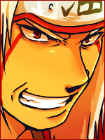
i see you changed the pesh text color its better now ^^You must be registered for see images
duh?
CnC please
And khaled I already heard urs please dont post here
Awards
how can you see it? >.< and btw, your sig is whory *q*i see you changed the pesh text color its better now ^^
Awards
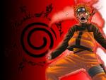
O.O u gay? Its naruto O_>how can you see it? >.< and btw, your sig is whory *q*
Awards
O_O he looked like a *cough*Chich*cough* there xDO.O u gay? Its naruto O_>
and the "trust me" text was soo wrong IMO XD
Yeah, but you should make it clearer and emphasize it using shadows.edited
and dude theres light source ~.~

Awards
it lacks creativity as well as skill. you need to think of something more than smudging. thats all you have done for a while now. the pic is cool, but u need a better background. also, the font doesn't go well with the sig. might want to soften the letters or something.You must be registered for see images
duh?
CnC please
And khaled I already heard urs please dont post here
4.5/10
Awards
WHo said itit lacks creativity as well as skill. you need to think of something more than smudging. thats all you have done for a while now. the pic is cool, but u need a better background. also, the font doesn't go well with the sig. might want to soften the letters or something.
4.5/10
anybody can criticize but you,my creativity is better than yours,and I didnt use only smudge,just u know only one tool and use it as your excuse to look smart
Awards
hah its naruto and you always think about bad things >_>O_O he looked like a *cough*Chich*cough* there xD
and the "trust me" text was soo wrong IMO XD
Awards
Does anyone feel it?it lacks creativity as well as skill. you need to think of something more than smudging. thats all you have done for a while now. the pic is cool, but u need a better background. also, the font doesn't go well with the sig. might want to soften the letters or something.
4.5/10
dude! you need to learn more about GFX, he deserves more than "4.5" because the smudging looks apparent, there's weak depth in it, light source need to be more apparent, text is bad but never mind him, I keep telling him to change but no hope xD
and wait! WTF do you mean by "soften the letters"? XD LMAO!
Most UPPER FAIL GFX line I ever heard XD