You are using an out of date browser. It may not display this or other websites correctly.
You should upgrade or use an alternative browser.
You should upgrade or use an alternative browser.
[Photoshop] Another Sig
- Thread starter Method
- Start date
More options
Who Replied?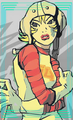
- Joined
- May 23, 2013
- Messages
- 674
- Reaction score
- 55
gods work man <3


- Joined
- Mar 12, 2014
- Messages
- 4,211
- Reaction score
- 568
Nice job !
But i think the render needs more blending, and i think the background is blurred too much also..
Try adding some good c4d's to make the the render blend to the background .....
Although the tag is quite pleasing to the eye !
Thats all i can say
good work *_*
But i think the render needs more blending, and i think the background is blurred too much also..
Try adding some good c4d's to make the the render blend to the background .....
Although the tag is quite pleasing to the eye !
Thats all i can say
good work *_*
Last edited:

- Joined
- Nov 28, 2010
- Messages
- 2,772
- Reaction score
- 570
Nice job !
But i think the render needs more blending, and i think the background is blurred too much also..
Try adding some good c4d's to make the the render blend to the background .....
Although the tag is quite pleasing to the eye !
Thats all i can say
good work *_*
Nice feedback
 Pretty much this haha. Try adding some text as well to give it more appeal. Other than that, fantastic work!
- Joined
- Feb 8, 2012
- Messages
- 8,150
- Reaction score
- 671
Nice the render needs some Blending
That it all good job man!
Nice job !
But i think the render needs more blending, and i think the background is blurred too much also..
Try adding some good c4d's to make the the render blend to the background .....
Although the tag is quite pleasing to the eye !
Thats all i can say
good work *_*
Nice feedback
Thank you all, I get real picky with my C4Ds, for reason I don't know, just makes things harder >.>
Text wise I am not so good with as I never experimented with styles of it so I usually try & avoid text if I am not comfortable with the outcome, somethign else I need to work on if time ever allows me.


- Joined
- Sep 25, 2012
- Messages
- 8,298
- Reaction score
- 1,484
PS CC? If so, I see ALOT of improvement!
This looks like a tag based specifically on depth, or it was intended to be so, with the render being the center focal point, so if I'm right, my only critique would be to reduce the background blur a bit because its overpowering with the render's sharpness.
Also, practice text T_T xD
This looks like a tag based specifically on depth, or it was intended to be so, with the render being the center focal point, so if I'm right, my only critique would be to reduce the background blur a bit because its overpowering with the render's sharpness.
Also, practice text T_T xD
- Joined
- Feb 8, 2012
- Messages
- 8,150
- Reaction score
- 671
PS CC? If so, I see ALOT of improvement!
This looks like a tag based specifically on depth, or it was intended to be so, with the render being the center focal point, so if I'm right, my only critique would be to reduce the background blur a bit because its overpowering with the render's sharpness.
Also, practice text T_T xD
Thanks, will mend on my next 1 xd. Text, ehhhh.......ahhhhh....

- Joined
- Feb 17, 2012
- Messages
- 1,897
- Reaction score
- 723
Nice tag mate, I agree somewhat with Horus said. The background is just a smidgen over blurred, if you used a guassian blur I would suggest lowering the strength to around 0.4px. If you didn't use a guassian blur, then I suggest you try it, using the strength I just mentioned. It will give the depth a more natural look.
As for the color, I love it!! and the lighting is really well executed. But it needs some shading in there to help give the piece some contrast. If you balance the lighting and shading it will help in more ways than one, not only will it give the tag some balance but it will also improve the overall atmosphere, as well as help with depth.
Text is nothing to fear, however it is something that will make or break a tag. To begin with I suggest taking time to practice with simple and standard fonts. A good combination is using impact for the main feature of your text, with smaller sub text in ariel and/or verdana, like this below. The main text is impact, and the sub text is verdana and ariel with some tiny text brushes for extra effects. It looks a bit average, but there is no tag behind it for it to blend with this is simply an example.
Anyway its still a pretty good tag so good job and KIU
As for the color, I love it!! and the lighting is really well executed. But it needs some shading in there to help give the piece some contrast. If you balance the lighting and shading it will help in more ways than one, not only will it give the tag some balance but it will also improve the overall atmosphere, as well as help with depth.
Text is nothing to fear, however it is something that will make or break a tag. To begin with I suggest taking time to practice with simple and standard fonts. A good combination is using impact for the main feature of your text, with smaller sub text in ariel and/or verdana, like this below. The main text is impact, and the sub text is verdana and ariel with some tiny text brushes for extra effects. It looks a bit average, but there is no tag behind it for it to blend with this is simply an example.
You must be registered for see images
Anyway its still a pretty good tag so good job and KIU