You are using an out of date browser. It may not display this or other websites correctly.
You should upgrade or use an alternative browser.
You should upgrade or use an alternative browser.
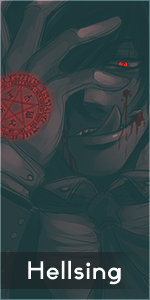
A Tag attempt
- Thread starter Voltron
- Start date
More options
Who Replied?
- Joined
- Apr 27, 2013
- Messages
- 1,006
- Reaction score
- 117
Yeah it's pretty cool xD.

- Joined
- Oct 15, 2012
- Messages
- 5,821
- Reaction score
- 463
Thanks^^thats pretty awsome my man... WOW Always and forever !!!
Yeah it's pretty cool xD.
thank you:bouncy:
- Joined
- Nov 6, 2012
- Messages
- 6,164
- Reaction score
- 377
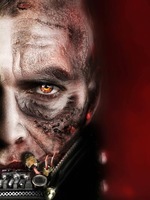
I feel like there needs to be more red, like te color of the lightning, in the background! But, I like it ^_^

- Joined
- Jan 23, 2012
- Messages
- 504
- Reaction score
- 73
Main text is good, maybe some sub text instead of that really tiny writing, i don't quite like really small text. It also needs to be closer to the render so you are looking at the same general area of the tag, not glancing back and forth from the render and text.
It's nice though for a first tag, the problem is that the dimensions of the tag are much too big. If you reduced the height and width, along with the render, there wouldn't be all that emptiness on the left hand side. It would be much easier to fill in, plus you have the text there to fill in some space.
The lightning off his arms are a nice touch, you could even make his eyes glow more with a soft yellow brush on low opacity. Flow is nice, background doesn't look to bad but it needs more detail, a little more work on blending and depth and you will be all set.
Keep up the good work. =D

")