
You are using an out of date browser. It may not display this or other websites correctly.
You should upgrade or use an alternative browser.
You should upgrade or use an alternative browser.
A tag ._.
- Thread starter -R-
- Start date
More options
Who Replied?



Y
YokoKurama
Guest
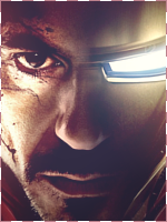
The bottom one is the better of the two.

4,673 posts
232 reactions
2


- Joined
- Apr 22, 2014
- Messages
- 4,673
- Status
- Activity Streak
:ls: :ls: :ls:

2,995 posts
422 reactions
1

- Joined
- Mar 10, 2014
- Messages
- 2,995
- Status
- Activity Streak
Now this is some serious art........
Good job bro
Good job bro

5,805 posts
652 reactions
3

- Joined
- May 4, 2012
- Messages
- 5,805
- Status
- Activity Streak
coooooooooooooooooooooooooooooool Sig .
. Probably Hei or Pav will CnC.
m not good at sigs
Only thing I want to point out that that Text. You could have used Golden colour for text
. Probably Hei or Pav will CnC.
m not good at sigs
Only thing I want to point out that that Text. You could have used Golden colour for text


8,298 posts
1,489 reactions
32


You've improved, that can be said. The text doesn't work there at all, but practice makes perfect ^^
The quality's a bit LQ though, try using a topaz filter and it should make the tag better, just my opinion.
The quality's a bit LQ though, try using a topaz filter and it should make the tag better, just my opinion.
2,646 posts
616 reactions
1

- Joined
- May 1, 2012
- Messages
- 2,646
- Status
- Activity Streak
Not going to say much because it's 2am and I should be asleep x_x.
I think if you applied the rule of thirds this could've been a super good tag, it's in the middle so the background is broken up on both sides so the atmosphere lacks a bit, it seems like you made an awesome background too so it wouldn't be hard to have built off of what you currently have background wise (I'm sure it won't happen due to adjustment layers and whatnot, but keep it in mind for future projects). I love the lighting, depth, flow would've been better if it was rotated 90 degrees so it's going with the way the render is instead of perpendicular to it. Your lighting is especially good in this, I really like how you darkened the edges a lot too. Maybe don't leave the exposure with such a bright gray next time, it's a bit too bright and takes away just a bit from the contrast. Your colours compliment each other very well and you did a good job placing the colours throughout the tag properly, well done. The text is bad but I'm not good enough at text to give you any tips on it. Don't put the fractal over the border noob x___x lol.
I think if you applied the rule of thirds this could've been a super good tag, it's in the middle so the background is broken up on both sides so the atmosphere lacks a bit, it seems like you made an awesome background too so it wouldn't be hard to have built off of what you currently have background wise (I'm sure it won't happen due to adjustment layers and whatnot, but keep it in mind for future projects). I love the lighting, depth, flow would've been better if it was rotated 90 degrees so it's going with the way the render is instead of perpendicular to it. Your lighting is especially good in this, I really like how you darkened the edges a lot too. Maybe don't leave the exposure with such a bright gray next time, it's a bit too bright and takes away just a bit from the contrast. Your colours compliment each other very well and you did a good job placing the colours throughout the tag properly, well done. The text is bad but I'm not good enough at text to give you any tips on it. Don't put the fractal over the border noob x___x lol.

GFX
Member
22 posts
0 reactions
- Joined
- Apr 29, 2014
- Messages
- 22
- Status
- Activity Streak
hi there.
composition is fine. font doesnt fit in. positioning could have been better, the font color doesnt match and the font-type is meh.
background is a bit messy and you could have worked better with the red fx (better positioning, maybe put the layer under the border).
but looks good overall
composition is fine. font doesnt fit in. positioning could have been better, the font color doesnt match and the font-type is meh.
background is a bit messy and you could have worked better with the red fx (better positioning, maybe put the layer under the border).
but looks good overall
Last edited:

4,211 posts
568 reactions
10

nice job there!!!!!!