I'll give some CnC because why not.
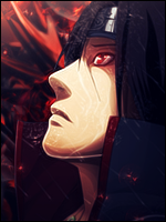
The first problem I find in this signature is your depth, this signature seems very flat. There seems to be very little to no blurring done, and that gives the effect of a render pasted onto a bg and altered a bit, which we know isn't the case. The second problem I see is your flow. The flow of your background goes against the flow of your render, and even some flow of your background contradict one another. The potential third problem I see is your light sources (although it might just be my eyes) it seems to me like the light on his chest is showing a light source coming off from the right side of him, meanwhile you just darkened it out. Although I like the fact that you took lighting into consideration when making the sig.
The good parts are definitely the colours, extremely easing to the eye and are pretty unique and vibrant. The colours of the render match the colours of the background well so it all falls into place there. I like the touch of adding a light source over your renders hand, definitely a good idea. The smudge (I think?) around the render was also a nice touch and came out well (even though they don't have a definite flow to them). The text is nice in my opinion, of course text is different based off of everyones likings.
That's about it o_o hope I helped/didn't sound too mean.


")