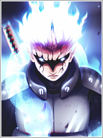
Uhh the first one has the most flaws
The background doesn't fit, try finding a background that will complement the colours on the render
The flow is messed up, or simply put it has no flow,work more on that
The light source is distracting, and takes away focus from the render, try reducing the opacity, that could work
There is practically no depth, try using shades, and blurring the far side of the bg to create depth, the burn and dodge tool helps in photoshop, but I don't know anything about gimp..sorry
The render is not well blended, a good trick to that is reducing the opacity of your brush, and erase the edges a little
")
The text doesn't fit, and wrong choice of font, try getting tuts on typos
most of the problems in the first appear in the rest as well, althoughthe remaining three you did better at attempting to blend it, als try adding more effects because they're empty.
Sorry I can't CnC everyone because I'm pretty much busy right now, if you need help, feel free to ask o__o