Awards
Ashley!
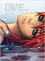
You must be registered for see images
Rate, critique etc.


The text is of that size because the render has those bold lines around it. That's why it's like that. But thanks for your input.hmmm
not quite sure how to rate this
i give it 8/10 mostly cause u had better works and personally im not that fond on this type of style
i feel like the orange rays (if they are rays at all) could use some work and text should be a bit smaller IMO
i guess that's the render (or a stock) u used but i dont quite like the thick black edges around it
but overall its a pretty good sig
")
I have to agree with this, and I have removed it. I don't know what I was thinking when I put it in.I agree with Kisame. : \
I find that bit of brushing to throw off the depth.