Hey, so i made kind of sig it's pretty simple but i think it's not that bad, so tell me what u think about it, what to improve, change etc.. rate if u want
and no, i won't change her clothes
oh and yea I've never done this before
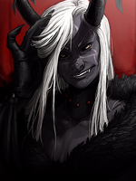
EDIT:
version2
and no, i won't change her clothes
You must be registered for see images
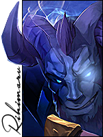
oh and yea I've never done this before
EDIT:
version2
You must be registered for see images
Last edited: