Awards


I was bored so I took a picture of my cat, Luna. Did a very EASY method.
This looked a little dark, so I turned down the opacity on my gradient map.
Soo which do you like more? If you don't answer your prolly post count raising, seeing as you didn't read the thread. xd
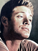
You must be registered for see images
This looked a little dark, so I turned down the opacity on my gradient map.
You must be registered for see images
Soo which do you like more? If you don't answer your prolly post count raising, seeing as you didn't read the thread. xd