
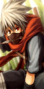
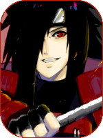
[Photoshop] Kisame_sig
- Thread starter Anduril
- Start date
More options
Who Replied?


MaSsMoOsAa
Member

TheForgottenSage
Member
Dude Could you make me one of either Shikimaru or Sage Mode Naruto? You don't have to but that's pretty Cool


Awards


Unfortunately, Sonic said the right thing again...I see why he turned it down, it's awful.
Awards
i wouldn't mind this, it looks cool
Thankscoooooooooooooooooooool !!..
i dont know!!That actually looks pretty damn cool, why did he turn it down?
he did not like it
ThanksAwesomeee! :y
Hmm i could try when i have time......i'll send u a VM when i doDude Could you make me one of either Shikimaru or Sage Mode Naruto? You don't have to but that's pretty Cool
I see why he turned it down, it's awful.
Hmm u 2 wouldn't mind giving a constructive criticism that would help to make it better ..............dont post if u dont like what u see!!!!Unfortunately, Sonic said the right thing again...
Just because u are really good at it does not mean u can go around saying everything is awfulll!!!! (That is harsh and also shows your arrogance)


Awards
Thanks will try to improve.its pretty good for a begginer. Keep trying
As for sonic and king w/e..... Next time you insult someones art,you have to explain why...not just go around saying shit about others work.
Awards
That actually looks pretty damn cool, why did he turn it down?
Anyways.I see why he turned it down, it's awful.
The problem with it is it lacks any real purpose.
The background is way to simple no effects, the renders you chose are very low quality, and the text doesn't really fit the background. You need to learn to choose better renders, take time on your work, learn ways to blend renders, make better more eye-catching backgrounds, and not put text on it unless it actually fits.

Awards
Anyways.
The problem with it is it lacks any real purpose.
The background is way to simple no effects, the renders you chose are very low quality, and the text doesn't really fit the background. You need to learn to choose better renders, take time on your work, learn ways to blend renders, make better more eye-catching backgrounds, and not put text on it unless it actually fits.
background doesn't fit, the text doesn't fit and i have no idea where you were going with that water shark image you tried to incorporate into it.
Thanks for all that this HELPS!!!!The edges are bad.
The transparency in the non-transparent part is messed up.
No blending.
No effects.
The shark doesn't fit.
:|
Will try to make it better.......

Awards
I could explain why but sometimes there is too much to explain or I don't have the time or I feel that someone else will explain it better than me.its pretty good for a begginer. Keep trying
As for sonic and king w/e..... Next time you insult someones art,you have to explain why...not just go around saying shit about others work.
I only say the truth and it's better than hiding behind false pretences.
Also calling me arrogant isn't that great because now I know to avoid your signatures because I know that I will end up being somewhat insulted in return.
Sorry but I want to try to defend myself because really my comments are helpful but sometimes there is a meaning behind them.
Considering I would need to make some point to the signature here is some .. CnC
Renders are bad and look stretched, the text doesn't really look right and you should perhaps not use text unless you know it will fit (Same to me too considering I am trying to use text o.o). There isn't any blending and to fix that you should use brushes or smudging. No depth really there so using the blur tool on the background should help with that. The effects are simply put, not there. There are no effects that are good and so you need to download c4d packs or you could make your own using Cinema4d. Fractals are another thing you can use for effects in your signatures, download fractals on deviantART.
Get renders from planetrender or deviant art
C4D/Fractals - DeviantART
Basically look at DeviantART for some tutorials and such to help you out.
Awards
Now that was really nice i am sorry for my previous comments ........I could explain why but sometimes there is too much to explain or I don't have the time or I feel that someone else will explain it better than me.
I only say the truth and it's better than hiding behind false pretences.
Also calling me arrogant isn't that great because now I know to avoid your signatures because I know that I will end up being somewhat insulted in return.
Sorry but I want to try to defend myself because really my comments are helpful but sometimes there is a meaning behind them.
Considering I would need to make some point to the signature here is some .. CnC
Renders are bad and look stretched, the text doesn't really look right and you should perhaps not use text unless you know it will fit (Same to me too considering I am trying to use text o.o). There isn't any blending and to fix that you should use brushes or smudging. No depth really there so using the blur tool on the background should help with that. The effects are simply put, not there. There are no effects that are good and so you need to download c4d packs or you could make your own using Cinema4d. Fractals are another thing you can use for effects in your signatures, download fractals on deviantART.
Get renders from planetrender or deviant art
C4D/Fractals - DeviantART
Basically look at DeviantART for some tutorials and such to help you out.
if u dont post this way i would keep doing the same mistakes and then u will again say it is still awful
so if u dont have time or dont feel like it just dont post comment........
sorry dude nothing personal u are tad helpful!!!!!
Awards
-.- I feel tad upset towards the quoted.dude
 I AM A GIRL.
 I have the girl gender icon on the top right of my post so I don't get why people call me a "dude" or a boy!
Awards
Well, sorry that you felt me kind of arrogant. I just stated my opinion. Also, I'm no good at GFX but I know some of the basics. The reason I don't try is that I don't have time, have much too much to improve on, never get really results I want to and don't have any photo-editing program like Photoshop.Hmm u 2 wouldn't mind giving a constructive criticism that would help to make it better ..............dont post if u dont like what u see!!!!
Just because u are really good at it does not mean u can go around saying everything is awfulll!!!! (That is harsh and also shows your arrogance)
Coming to your siggy, As for CnC. Well, the real water background doesn't fit with the Anime characters. Render/pictures are also too stretched.
The shark doesn't fit anywhere really. Font could be much much better. Effects like blur/smudge and brushes are completely missing. Even the blending is not really what's needed.
All-in-all, you have way too much room to improve. I don't mind people trying. In fact, it is by perseverance that success come along but continuous rushed struggle isn't really what's will make it good. I don't tink I said anything arrogant but perhaps saying to someone that something is not good, is a bit harsh. Sorry but what I meant was that it was not good as there were much too much ways for it to look better....
Try to have some patience (by reading some good tuts, search proper renders, textures ect...) and give your sig and the others that you'll try more time and dedication that you'll achieve by proper lessons!