[Gimp] Siggy.
- Thread starter Gobi Gobletsson
- Start date
More options
Who Replied?


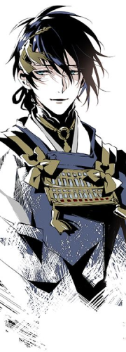
Kinda simple bro, it's good that the render kinda matches the background but I would have liked to see you try to smudge the render with the background or use some C4D's to show you are willing to try new things, but this isn't bad, good job on a simple yet nice sig ")

Lstrange18
Member
Awards
Thankies.I like its simplicity. It is an 8
Could you give me an example?Kinda simple bro, it's good that the render kinda matches the background but I would have liked to see you try to smudge the render with the background or use some C4D's to show you are willing to try new things, but this isn't bad, good job on a simple yet nice sig
Thankies.Very nicely done

Awards


Good, it looks fine. But I would want to give you some tips on how to improve it.
Firstly, it is plain, I suggest add some cool background ... I use to duplicate the background into layers .. and then I change their blending option (Color dodge, luminosity .. etc) Go play with them. Set an opacity in range of 20-30 .. you can play with it too ^^
Second, add more cool stuff, I can see that your word has improve, Im sure you know some skills in brushing. Go get cool brush in the internet which I suggest Deviantart.com , up to u where do u want to place it, prolly you can add some Glow effect.
Awards
Awards
Hehe, xdI kinda like it. Something is surely missing, but it's better than a picture with TONS of trash in it. =D


Could you give me an example?
Just view other threads in this section and see how they have some that are smudged and a bit with the background. 
Awards
I said I can only play in the Weekends, also feel free to notice me when you play O_O'Get back on Minecraft Gobi,your GFXing is shit.
Render stands out too much,background is random.
I'll try. o.o
Don't know, lol. But thanks.Not to much pizazz
It's alright though, how long have you been using gimp

Awards

Awards