Awards
an attempt at a smudge sig, maybe too much blue :nuts:
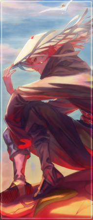
CnC appreciated
You must be registered for see images
CnC appreciated


")
thanksnice ,
thank youNice, the amount of blue is OK in my opinion.
thanks for the feedback manThe actual flow and colors are really good mate, but the issue is the brush you used for the smudging. It looks like you used a soft brush, and for this particular style of smudging a soft brush is a big no no. Use a 100% hard round brush with a strength of 90-95, that way your smudging won't look blurry. Then and you will get more and better detail in the smudging, also change the sizes of your brush often, smaller for fine detail larger for base smudging. But keep up the good work mate, you will get the hang of it
Btw I may have overused the word "smudging"
thank youI like this. xD I mean you could have work more on the balls, you know, like blending it more into the blue smudge and I think then it would look much better. But really, really nice try. xD