[Photoshop] Sigs
- Thread starter Ragnaroc
- Start date
More options
Who Replied?


Awards
what O_OI like the better one better
ok i like them a lot and i like the one with the guy poniting some where where b/c it look like you use c4d

Awards

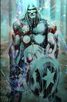
you have 1 think which most beginners dont have-a sense of flow. that makes these tags at least decent.I finally decided to ask for some C&C, but be nice about it!
You must be registered for see images
You must be registered for see images
now, the first thing is the quality. u seemed to have blurred it up around the focal. never do that. if anything, i suggest sharpening it.
your use of fractals is decent, but needs a lot of work. one thing you can do is make the size smaller becuz the tag is so simple. i also dont like that b&w stuff.
for now, just dont even put text until u get better. it kind of ruins the tag. also, use real renders. these seem to be pics that you cut out or something =/
overall, i like where you are going. flow is nice, jut pay more attention to the colors u use. it matters a lot O.O also, you might want to start adding c4d's, brushes, etc. as of now, these are too simple to be called tags.

Awards
yeah I appreciate the feedback, when i do do another sig i'll try to do better!..you have 1 think which most beginners dont have-a sense of flow. that makes these tags at least decent.
now, the first thing is the quality. u seemed to have blurred it up around the focal. never do that. if anything, i suggest sharpening it.
your use of fractals is decent, but needs a lot of work. one thing you can do is make the size smaller becuz the tag is so simple. i also dont like that b&w stuff.
for now, just dont even put text until u get better. it kind of ruins the tag. also, use real renders. these seem to be pics that you cut out or something =/
overall, i like where you are going. flow is nice, jut pay more attention to the colors u use. it matters a lot O.O also, you might want to start adding c4d's, brushes, etc. as of now, these are too simple to be called tags.
and they are straight pictures because its nearly impossible to find renders for the Kai and Lightning Tiger Characters.
Awards


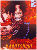
Text stands out too much
Try moving it near the focal a bit and set to a blending mode you like/reduce opacity
Kind of proper use of c4d in the first one, it flows nice
Use some gradients to match the colos
Try using this
And download some splatter o_o
Try moving it near the focal a bit and set to a blending mode you like/reduce opacity
Kind of proper use of c4d in the first one, it flows nice
Use some gradients to match the colos
Try using this
You must be registered for see links
And download some splatter o_o