- Joined
- May 15, 2013
- Messages
- 58,956
- Reaction score
- 3,171
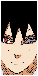
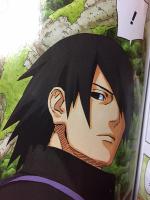
Before:
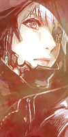
After:
Note's: The shirt is actually white, you can see the left shoulder, I dunno if I did it correctly, but majority is grey because of the "shaded" effect on the blank manga panel. So... yeah... I would have done it without the speech bubble, but I just couldn't make it look right.
  Rinnegan is normal colour because of the last colour cover that contradicted the red of the "Official colour chapter".
Programs used:
* Paint Tool Sai
* Photoshop
Hopefully you all like it! Thanks!
You must be registered for see images
After:
You must be registered for see images
Note's: The shirt is actually white, you can see the left shoulder, I dunno if I did it correctly, but majority is grey because of the "shaded" effect on the blank manga panel. So... yeah...
I would have done it without the speech bubble, but I just couldn't make it look right. Rinnegan is normal colour because of the last colour cover that contradicted the red of the "Official colour chapter".Programs used:
* Paint Tool Sai
* Photoshop
Hopefully you all like it! Thanks!