You are using an out of date browser. It may not display this or other websites correctly.
You should upgrade or use an alternative browser.
You should upgrade or use an alternative browser.
~Next
- Thread starter LitzSabr
- Start date
More options
Who Replied?
- Joined
- Apr 30, 2010
- Messages
- 973
- Reaction score
- 281
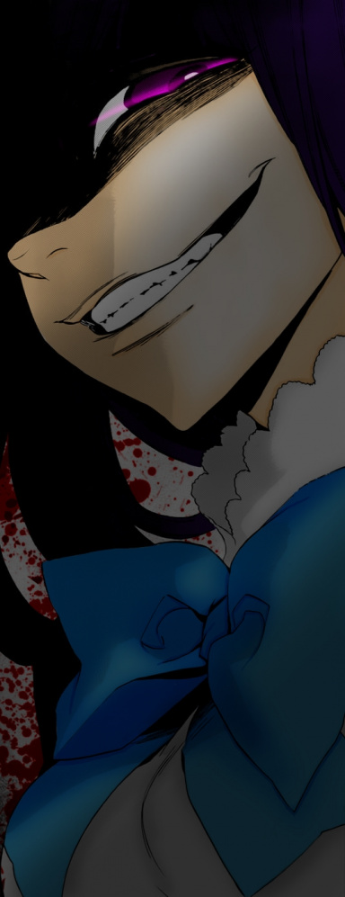
That car sig ! love it great work !

- Joined
- Mar 10, 2014
- Messages
- 2,995
- Reaction score
- 422
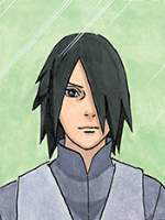
Awesome work dude.I like the first one more,especially the flow in that,you need to work with the text though.
+rep
+rep

- Joined
- Mar 13, 2013
- Messages
- 3,045
- Reaction score
- 226
Thanks guys
Yeah, a friend told me about the position before. I tested it by putting it near shoulder, but to me suited the flow better where it's now. Maybe it's just me xd.. but Thanks
I like the first one more. Good lighting, great flow but only the text could been better placed, to go more well with the flow.
nonetheless both are fantastic!
Yeah, a friend told me about the position before. I tested it by putting it near shoulder, but to me suited the flow better where it's now. Maybe it's just me xd.. but Thanks
Last edited:


- Joined
- Sep 25, 2012
- Messages
- 8,298
- Reaction score
- 1,484
Damn! Now this is wonderful stuff, kudos ")
I appreciate that you put effort into your work ^^
Keep it up Litz!
CnC:
I'm not gonna go too deep into it, mainly because I'm lazy as hell ._.
For the first one, the only thing I dislike is the positioning of the text, it goes against the rule of thirds, but that's completely fine because in art, imagination flows.
Also, you can add a topaz filter to make it look really HQ, unless you were aiming for a grainy appearance (this is mainly pointing to the render itself)
For the second one, the only things I don't like are the lighting levels, they're too high in my opinion, and the fractals around the car itself, they're not "blending" to me, but meh, that's just nit picking >_<

- Joined
- Dec 6, 2012
- Messages
- 80,546
- Reaction score
- 4,116
The second one is amazing,

- Joined
- Mar 13, 2013
- Messages
- 3,045
- Reaction score
- 226
Damn! Now this is wonderful stuff, kudos
I appreciate that you put effort into your work ^^
Keep it up Litz!
CnC:
I'm not gonna go too deep into it, mainly because I'm lazy as hell ._.
For the first one, the only thing I dislike is the positioning of the text, it goes against the rule of thirds, but that's completely fine because in art, imagination flows.
Also, you can add a topaz filter to make it look really HQ, unless you were aiming for a grainy appearance (this is mainly pointing to the render itself)
For the second one, the only things I don't like are the lighting levels, they're too high in my opinion, and the fractals around the car itself, they're not "blending" to me, but meh, that's just nit picking >_<
Thanks for the CnC. For the second, they are just supposed to be sparks,, see if they blend now Xd.
Nicely done man.
The second one is amazing,
Thanks guys
Really nice works. Love the first one.
PS: BTW I am Angat from Nexus Signature
Thanks man. Good to know you're here too
Last edited:
