[Photoshop] Ichimaru Gin
- Thread starter zenron
- Start date
More options
Who Replied?

Awards

Well i like it but the lines are not much visible,for me it looks like painted, and the highlight on his nose is a bit moved on the right side idk if that is only for me, but anyway i like the shades you used , but for the next time i would suggest that you put every layer on Multiplye to get darker lines or you can duplicate the original layer and set it on Multiplye.
Keep it up xd
Keep it up xd

Awards
Your missing the point with the lines :S... I don't want them to be visible... that was the thing I was trying to do. I'm not trying to do an anime style.Well i like it but the lines are not much visible,for me it looks like painted, and the highlight on his nose is a bit moved on the right side idk if that is only for me, but anyway i like the shades you used , but for the next time i would suggest that you put every layer on Multiplye to get darker lines or you can duplicate the original layer and set it on Multiplye.
Keep it up xd

Awards


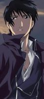
I like it,but it looks a bit blurred and he looks like a retard ._.You must be registered for see images
yey!
Awards
LOL well i like the face but i can rarelly see shades on the captains ropeYour missing the point with the lines :S... I don't want them to be visible... that was the thing I was trying to do. I'm not trying to do an anime style.
Awards
I just realised I didn't shade part of it :S.LOL well i like the face but i can rarelly see shades on the captains rope


Awards
ROFL i did and i said its a bit too bright like a painted version, and you rarelly shades the clothes. if you want i could send you some other lineartsIt's like... nobody even read my topic on how to give CnC...


Awards
I like where this is going. But you need to put the lines there. it makes everything look straighter, and neater, almost like a skeleton that hold the pic together.
but the shading looks good. you definatly need to make those shade lines straighter (if you wont put the lineart lines) just to make it look neat. The hair looks good too. once again, need straighter shade lines if u wont put in the lineart lines.
but the shading looks good. you definatly need to make those shade lines straighter (if you wont put the lineart lines) just to make it look neat. The hair looks good too. once again, need straighter shade lines if u wont put in the lineart lines.