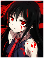
The second avatar is the best.I'd add more red and yellow to the armor and sharpen the parts so the colors would stand out more.
3rd one needs more light from the top left + work more with the stock itself,maybe some metal glow on his suit would go just great + some minor adds with color adjustment.
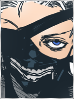
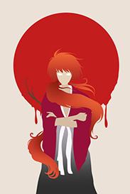
As for the 4th one... umm that one looks a bit lq indeed,especially hair part. And that border... it's a double kill man >.>
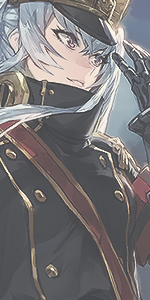
The last one is good,like the stock.
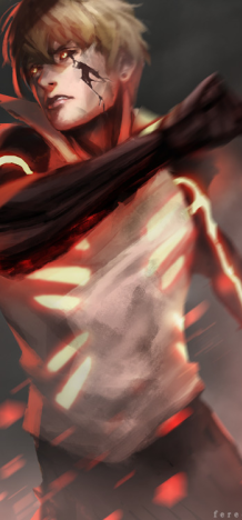
I purposely skipped the 1st avatar because it's the worst of all 5.Mehh maybe it's beacuse of the stock itself... it's doesn't make a good avy imo,not sure if i got the idea of blue toned edges but it looks off and doesn't go anywhere.
I mostly have seen your signature tags,is it your fisrt avatar pack ? anyway,itwas interesting to see your work with avatars.


")