Awards
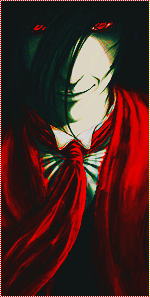
i made this one just now. what do u think?
You must be registered for see images


maybe circles would suit it more? The colours are cool but the squares.. there is something wrong with them, and i dont know what =Osay what
hm... =/maybe circles would suit it more? The colours are cool but the squares.. there is something wrong with them, and i dont know what =O
well, your the gfx'er xDDhm... =/
i think they work fine. i tried some other shapes, but squares looked the best...
rly? i thou8ght it looked better than sum text...OMG , Nice O_O Though I don't like those so squares ^__^
I have no idea =P If you like it, that is all you need to know ,hehe =3rly? i thou8ght it looked better than sum text...


I like the squares,maybe they could be a bit nearer to the focalsay what
thank you, that is exactly why i put them.wth? everyone square-hating.
i find the squares the best part of the picture, it kind of brings everything together. awesome job.

I say no shapes. They stand out too muchhm... =/
i think they work fine. i tried some other shapes, but squares looked the best...
. I like effects here, but the composition is a bit off. By that I mean floating head syndrome. You don't want a floating head really.