You are using an out of date browser. It may not display this or other websites correctly.
You should upgrade or use an alternative browser.
You should upgrade or use an alternative browser.
[Photoshop] Carnage!
- Thread starter Beastbomb
- Start date
More options
Who Replied?

- Joined
- May 8, 2012
- Messages
- 2,168
- Reaction score
- 232
Looks great! Carnage is the shit.


- Joined
- May 8, 2013
- Messages
- 6,626
- Reaction score
- 116
Carnage is Le bomb... Makes Le Venom look lame!

- Joined
- Dec 29, 2011
- Messages
- 4,521
- Reaction score
- 295
I like it, no complaint from my part ^^

- Joined
- Feb 14, 2012
- Messages
- 2,044
- Reaction score
- 240
Looks great, I couldn't find a single flaw except that I hate text position. 


- Joined
- Feb 17, 2012
- Messages
- 1,897
- Reaction score
- 723
I like it! Good job.
Thanks
looks awesome .
Thanks
Looks great! Carnage is the shit.
Thanks
Looks epic.
Well done bomb *_*
Cheers Nef
Carnage is Le bomb... Makes Le Venom look lame!
Lol agreed and thanks
I like it, no complaint from my part ^^
Cheers TLS
Looks great, I couldn't find a single flaw except that I hate text position.
Cheers and there was no where else to put it
I hate that you rarely need CnC xD
This is perfect
Thanks Horus, but I always need some sort of CnC. Its what helps me improve and get better
This is brilliant!
Cheers FTR

- Joined
- Feb 17, 2012
- Messages
- 1,897
- Reaction score
- 723
Ermahgerd. That's my old username
images always look oversaturated on my phone, I'm sure it's awesome!
Thanks mate


- Joined
- May 1, 2012
- Messages
- 2,646
- Reaction score
- 616
I might be drunk because I'm the only one on here and SL who don't like things about this tag .-.
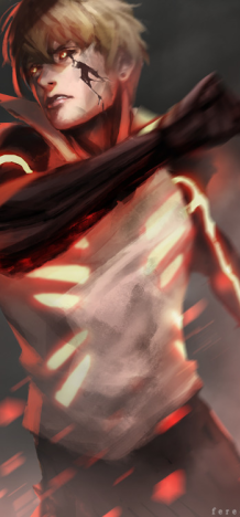
The flow is a bit choppy (but is to be expected due to the render), the light source on top of his head should be much stronger, the edges should be a lot darker. The overall bottom half of the sig is really empty, especially the left side. Not really enough contrast either imo. >_> I dunno. Just things I see.
The flow is a bit choppy (but is to be expected due to the render), the light source on top of his head should be much stronger, the edges should be a lot darker. The overall bottom half of the sig is really empty, especially the left side. Not really enough contrast either imo. >_> I dunno. Just things I see.

- Joined
- Aug 10, 2011
- Messages
- 2,529
- Reaction score
- 320
You're not drunk.I might be drunk because I'm the only one on here and SL who don't like things about this tag .-.
The flow is a bit choppy (but is to be expected due to the render), the light source on top of his head should be much stronger, the edges should be a lot darker. The overall bottom half of the sig is really empty, especially the left side. Not really enough contrast either imo. >_> I dunno. Just things I see.
- Joined
- Feb 17, 2012
- Messages
- 1,897
- Reaction score
- 723
I might be drunk because I'm the only one on here and SL who don't like things about this tag .-.
The flow is a bit choppy (but is to be expected due to the render), the light source on top of his head should be much stronger, the edges should be a lot darker. The overall bottom half of the sig is really empty, especially the left side. Not really enough contrast either imo. >_> I dunno. Just things I see.
I agree about the lightsource above his head, I noticed that when I finished it. But couldn't be bothered fixing it, if I darkened the edges anymore it would look like one big thick border and its not the look I was going for. As for being empty, it may appear that way but the whole tag is covered with and abstract c4d. I never intended it to be overflowing with effects, I went for atmosphere. Its not going to be for everyone's liking but I like it
You're not drunk.
Like I said to Pav, its not going to be liked by everyone. But maybe you are drunk, idk just a guess
The tongue reaches out way to far to the right of the tag, and it bothers me. You could have erased it a bit, so it fades out.
Nah that would have looked stupid imo, a tongue that fades out half way along. Its one of the focal points of the render, I may as well fade out his head as well
But I thank you all for your CnC I appreciate it
except Genjin who's post was nothing more than a waste of space.
- Joined
- Jan 16, 2011
- Messages
- 41,396
- Reaction score
- 2,409
Nah that would have looked stupid imo, a tongue that fades out half way along. Its one of the focal points of the render, I may as well fade out his head as well
Yeah, well you can't see it because you've been looking at your work for too long.
The end of the tongue is not a focal. The head works because there is a light source behind it. The tongue does not, because it is overlapping the shadow right on the edge of the tag. You could've at least overlapped the tip of the tongue with a C4D like you did with the arm, or extended the right of the canvas a bit more.
Each to his own though. Although, I'd recommend you listen.
- Joined
- Feb 17, 2012
- Messages
- 1,897
- Reaction score
- 723
Yeah, well you can't see it because you've been looking at your work for too long.
The end of the tongue is not a focal. The head works because there is a light source behind it. The tongue does not, because it is overlapping the shadow right on the edge of the tag. You could've at least overlapped the tip of the tongue with a C4D like you did with the arm, or extended the right of the canvas a bit more.
Each to his own though. Although, I'd recommend you listen.
Don't get me wrong, I never said I wasn't listening to what you said, and I appreciate what you said. I'm just saying that a long tongue is a feature of carnage, I probably should have done a better job with bringing out the tongue more. I just don't think erasing some or half of it would do it any justice to me it would look wierd thats all