1st attempt at bigger canvas
- Thread starter Flaw
- Start date
- Status
- Not open for further replies.
More options
Who Replied?


Awards

dude, you have to learn how to do more in photoshop. every time, i see the same exact things from u. Same effects, similar colors. its getting old. why dont you try to impress us with something new?You must be registered for see images
CnC
Awards
is it freaky ?dude, you have to learn how to do more in photoshop. every time, i see the same exact things from u. Same effects, similar colors. its getting old. why dont you try to impress us with something new?
cos if it is ill keep making more :3

It fails, and I am not trying to be mean to you as I usually am.
There's nothing new to it, except a bigger canavas, the quality is shitty for some reason and the splatters on it are overused.
Try something new, boy.
There's nothing new to it, except a bigger canavas, the quality is shitty for some reason and the splatters on it are overused.
Try something new, boy.
Awards
lol the photoshop expert ciritcized me i should be honoredIt fails, and I am not trying to be mean to you as I usually am.
There's nothing new to it, except a bigger canavas, the quality is shitty for some reason and the splatters on it are overused.
Try something new, boy.

You can accept criticism or kiss my ass.lol the photoshop expert ciritcized me i should be honored
Why the hell did you post it if you don't take criticism?
Awards
i dont take criticism from noobs ._>You can accept criticism or kiss my ass.
Why the hell did you post it if you don't take criticism?

Awards


Yeah, at least noobs don't suck as much as you.i dont take criticism from noobs ._>

your post made me laugh the most xD rofl seriously i dont know whyroflmao !!!!!!!!
and i suck at photoshop so i wont say anything but to much bright red use a little darker so it is bloody and cool

Awards
no. it sucks to tell u the truth. but for some reason, u keep making more.is it freaky ?
cos if it is ill keep making more :3
Awards
out of insults ?Yeah, at least noobs don't suck as much as you.
so i can freak u out ._.no. it sucks to tell u the truth. but for some reason, u keep making more.


Awards
look, dude. stop being an idiot. you have to get better at photoshop. just accept it.out of insults ?
so i can freak u out ._.

Awards
O B J E C T S !! S H U T T H E F U C K U P !!!!!!
Lmao, that line is ****ed up xD
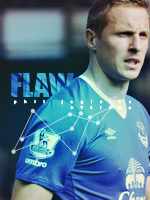
anyways, I liked the right side =], the left side is....AAHHH!!! Fing EDGES!! D= *dies* Likey the text, although the main font sucks =| no depth, light isn't balanced [GET THE PHRASE DAMMIT! XD], too much splatters =O
and you made sigs with this style before =O It's recommend that you change it =O
Lmao, that line is ****ed up xD
anyways, I liked the right side =], the left side is....AAHHH!!! Fing EDGES!! D= *dies* Likey the text, although the main font sucks =| no depth, light isn't balanced [GET THE PHRASE DAMMIT! XD], too much splatters =O
and you made sigs with this style before =O It's recommend that you change it =O
Last edited by a moderator:


- Status
- Not open for further replies.