- Joined
- May 1, 2012
- Messages
- 2,646
- Reaction score
- 616
New to GFXing? Just trying to get better? It wouldn't hurt to take the time out of your day to read this then. I'll be going over what a good signature has and needs, and will also go over the terminology some GFXers use.
First and foremost: I do not take credit for making any/all of the signatures provided below.
That about wraps this tutorial up, if you feel that I’ve missed something, or was misinformed about something, let me know. This was my first attempt at a guide/tutorial and I would really like some feedback, although I don’t more than per say 10 of you are going to read this :3.
First and foremost: I do not take credit for making any/all of the signatures provided below.
Key Words
Focal = The focal is the main thing of your signature you’re focusing on. When a viewer loads your image, the first thing your viewer should see is the focal of your signature. If you have a render of a person and want your viewer to focus on their face, their face is the focal of the signature.
bg = Background. (Referring to the background of your signature, the stuff you put behind your render and around the focal)
Tag = A tag is just another name for a signature.
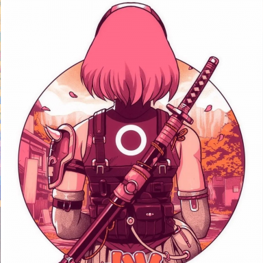
Stock = A stock is an image where there's a background image behind the focus of the picture. This is rather self explanatory.
Render = A render is a picture of something (generally people or items) that doesn't have a background behind it. This part's a bit tricky. When I say it doesn't have a background, I'm not saying that there's white around the item. I'm saying there's no other colours behind it to fill up the rest of the picture. This could be tricky at times and you must make sure there's no background in your image prior to deciding to use it only to paste it into your GFX program and for there to be a white background and all your efforts were for nothing.
Fractal = A fractal is an effect usually put on near the end of finishing your tag. Fractals are usually put to fill up empty space, or to make things seem not so dull. Some examples could range from a space stock, or bubble effects. It should be noted that these fractals shouldn't be on the layer type of "Normal", that'd be silly. Instead I'd suggest playing around with things such as overlay/lighten only/screen/dodge/soft light/etc. and changing around the opacity until you find an optimal fractal usage for you.
Notice how there's blue lights? Those are fractals. They're used to make the sig overall look "less boring" per say. It'd seem a lot more bland if those fractals weren't placed there. These seem like small things, but they could be the difference between a good tag and a great tag
Now the big one, C4D = A C4D is A Cinema 4D. These are huge in signature making, I can't stress enough how important it is to use good C4Ds and how to place them properly. Experiment with C4Ds a lot, they help with flow, depth, lighting, colours, they could set up optimal spots for text.. These are your best friends as a GFXer. I might be putting a bit too much emphasis on this, but it's only because I encourage new GFXers strongly to use C4Ds if they want to up their level of skill and understanding. There's two types of C4Ds, Background C4Ds and render C4Ds, both do what you'd expect of them. The background C4Ds tend to have a background behind as well as the C4D so you could use it as the background for your tag, while the render C4Ds are renders used for adding depth and flow.
Focal = The focal is the main thing of your signature you’re focusing on. When a viewer loads your image, the first thing your viewer should see is the focal of your signature. If you have a render of a person and want your viewer to focus on their face, their face is the focal of the signature.
bg = Background. (Referring to the background of your signature, the stuff you put behind your render and around the focal)
Tag = A tag is just another name for a signature.
Stock = A stock is an image where there's a background image behind the focus of the picture. This is rather self explanatory.
Example of a stock
Notice that there's a focus of the picture (the boy) and there's other things besides just him in the picture as well. (e.g. Ghosts, windows, house, piano, etc.)
You must be registered for see images
Render = A render is a picture of something (generally people or items) that doesn't have a background behind it. This part's a bit tricky. When I say it doesn't have a background, I'm not saying that there's white around the item. I'm saying there's no other colours behind it to fill up the rest of the picture. This could be tricky at times and you must make sure there's no background in your image prior to deciding to use it only to paste it into your GFX program and for there to be a white background and all your efforts were for nothing.
Example of Render
Example of things that aren't renders (THESE ARE CONSIDERED STOCKS)
You must be registered for see images
You must be registered for see images
Fractal = A fractal is an effect usually put on near the end of finishing your tag. Fractals are usually put to fill up empty space, or to make things seem not so dull. Some examples could range from a space stock, or bubble effects. It should be noted that these fractals shouldn't be on the layer type of "Normal", that'd be silly. Instead I'd suggest playing around with things such as overlay/lighten only/screen/dodge/soft light/etc. and changing around the opacity until you find an optimal fractal usage for you.
You must be registered for see images
Now the big one, C4D = A C4D is A Cinema 4D. These are huge in signature making, I can't stress enough how important it is to use good C4Ds and how to place them properly. Experiment with C4Ds a lot, they help with flow, depth, lighting, colours, they could set up optimal spots for text.. These are your best friends as a GFXer. I might be putting a bit too much emphasis on this, but it's only because I encourage new GFXers strongly to use C4Ds if they want to up their level of skill and understanding. There's two types of C4Ds, Background C4Ds and render C4Ds, both do what you'd expect of them. The background C4Ds tend to have a background behind as well as the C4D so you could use it as the background for your tag, while the render C4Ds are renders used for adding depth and flow.
Examples of background C4D and render C4D
I can't stress enough how malleable and vital C4Ds are in a proper tag. C4Ds don't only have to be on a "normal" layer type, they could also be on others, such as overlay/soft light/screen/etc. etc. (more than 50% of the layers in my opinion could make a well placed C4D an improvement) Not only are there C4Ds such as this, but there's also bubble C4Ds, and other C4Ds of different natures you could use.
You must be registered for see images
You must be registered for see images
There are generally 5 key factors to keep in mind when GFXing. These 5 factors consisting of:
Depth, Flow, Placement, Lighting, and Text.
(A sub factor in my opinion would also be colour complimentary of render but I'll get into that later)
Depth, Flow, Placement, Lighting, and Text.
(A sub factor in my opinion would also be colour complimentary of render but I'll get into that later)
Depth
Depth, to put it lightly, is what makes your signature look like part of the picture. If a picture doesn't have any depth, it will look like you just pasted a render onto a background and that's that. But if you have depth in your GFX then it will look as if the render is part of the picture itself instead of just pasted in there. (Depth could also potentially help blend your signature if done properly)
So, some ways to achieve this are mainly blurring out and/or sharpening some parts of your signature. This is generally the easiest step to achieve or maintain. More advanced methods of depth would be adding C4Ds in front of and behind the render itself to make it seem like the render is actually in the picture instead of pasted on top of it.
There's a ridiculous amount of depth in these signature, and it's fairly noticeable by the blurring and sharpening done to objects in it. Notice how the background is blurred out a lot and how there's still a noticeable amount of blurring done to other objects, but not at the extent of the background. This gives the tag a great sense of depth. Also, in the second tag, there's also effects over the render as well, which just adds more depth to the tag itself making it just that much better.
This signature is lacking depth, it seems that there's just a render pasted onto a background and that's that. (aside from some added text and lighten enhancements)
Depth, to put it lightly, is what makes your signature look like part of the picture. If a picture doesn't have any depth, it will look like you just pasted a render onto a background and that's that. But if you have depth in your GFX then it will look as if the render is part of the picture itself instead of just pasted in there. (Depth could also potentially help blend your signature if done properly)
So, some ways to achieve this are mainly blurring out and/or sharpening some parts of your signature. This is generally the easiest step to achieve or maintain. More advanced methods of depth would be adding C4Ds in front of and behind the render itself to make it seem like the render is actually in the picture instead of pasted on top of it.
You must be registered for see images
You must be registered for see images
There's a ridiculous amount of depth in these signature, and it's fairly noticeable by the blurring and sharpening done to objects in it. Notice how the background is blurred out a lot and how there's still a noticeable amount of blurring done to other objects, but not at the extent of the background. This gives the tag a great sense of depth. Also, in the second tag, there's also effects over the render as well, which just adds more depth to the tag itself making it just that much better.
You must be registered for see images
This signature is lacking depth, it seems that there's just a render pasted onto a background and that's that. (aside from some added text and lighten enhancements)
Flow
Flow is the general "direction" your tag seems to be going in. Flow makes signatures more pleasing to the eye and avoids that feeling of "too much happening" or "messiness" than you would if there wasn't flow in your tag. You should always make sure the direction of your flow compliments your render. (ex. If the render is standing straight up, make the flow up/down, not left/right. It will complement the render itself and it's easier to blend as well)
Some ways you could achieve flow are by placing C4Ds well to make it look as if they're going a certain direction, or by smudging in the general direction of your render. Other ways would be playing around with the lighting of your tag itself and seeing if your fractals could also add to your flow.
This tag is a great example of flow (and definitely depth). The general motion of the tag is visibly going up and to the left. The render also seems to have that same "flow" to it. So by using well placed C4Ds, the artist made the tag much more pleasing to the eye, and a lot cleaner by simply adding C4Ds in the direction of the render.
This is an example of bad flow, and what happens when your C4Ds are poorly placed (or you picked bad C4Ds for your tag). The general consensus he's trying to provide in this tag is that the flow is going "away" from the render, although it was poorly executed by leaving the background nearly blank and only adding 1 C4D over the render to try to have that alone provide flow. Usually, the more C4Ds that compliment the flow, the better (although don't go overboard with it or it'll backfire miserably and there would be too much going on in the signature and you would lose your focal)
Flow is the general "direction" your tag seems to be going in. Flow makes signatures more pleasing to the eye and avoids that feeling of "too much happening" or "messiness" than you would if there wasn't flow in your tag. You should always make sure the direction of your flow compliments your render. (ex. If the render is standing straight up, make the flow up/down, not left/right. It will complement the render itself and it's easier to blend as well)
Some ways you could achieve flow are by placing C4Ds well to make it look as if they're going a certain direction, or by smudging in the general direction of your render. Other ways would be playing around with the lighting of your tag itself and seeing if your fractals could also add to your flow.
You must be registered for see images
This tag is a great example of flow (and definitely depth). The general motion of the tag is visibly going up and to the left. The render also seems to have that same "flow" to it. So by using well placed C4Ds, the artist made the tag much more pleasing to the eye, and a lot cleaner by simply adding C4Ds in the direction of the render.
You must be registered for see images
This is an example of bad flow, and what happens when your C4Ds are poorly placed (or you picked bad C4Ds for your tag). The general consensus he's trying to provide in this tag is that the flow is going "away" from the render, although it was poorly executed by leaving the background nearly blank and only adding 1 C4D over the render to try to have that alone provide flow. Usually, the more C4Ds that compliment the flow, the better (although don't go overboard with it or it'll backfire miserably and there would be too much going on in the signature and you would lose your focal)
Placement
So, in the GFXing world, there's something called "The rule of thirds" this is where the picture you have (usually regardless of size, unless it’s obviously too small) is split into thirds horizontally and vertically (giving you a total of 9 “boxes” on your image.)
This has an interesting role in the world of tag making. Generally speaking, you don’t want your render to be in the center of the middle box (obvious exceptions such as vertical tags and etc.), there’s a couple of interpretations as to why. Mine is that it somewhat limits your creativity and tag making skill. If it’s in the center, you’re going to have to make 2 smaller backgrounds (one on the left and one of the right) while if you put your renders to the side of the tag, you get to make one large complex background which exemplifies things such as depth/flow/etc.
Example of good placement
This tag is great, because the render is on the right side, the artist got to express their creativity by making one large background to fill the atmosphere.
Example of bad placement
Due to the placement of the tag, the artist couldn't get creative with the background and only had the option to stick to making two separate backgrounds (one on left, one on right) which really killed the atmosphere.
So, in the GFXing world, there's something called "The rule of thirds" this is where the picture you have (usually regardless of size, unless it’s obviously too small) is split into thirds horizontally and vertically (giving you a total of 9 “boxes” on your image.)
You must be registered for see images
This has an interesting role in the world of tag making. Generally speaking, you don’t want your render to be in the center of the middle box (obvious exceptions such as vertical tags and etc.), there’s a couple of interpretations as to why. Mine is that it somewhat limits your creativity and tag making skill. If it’s in the center, you’re going to have to make 2 smaller backgrounds (one on the left and one of the right) while if you put your renders to the side of the tag, you get to make one large complex background which exemplifies things such as depth/flow/etc.
Example of good placement
You must be registered for see images
This tag is great, because the render is on the right side, the artist got to express their creativity by making one large background to fill the atmosphere.
Example of bad placement
You must be registered for see images
Due to the placement of the tag, the artist couldn't get creative with the background and only had the option to stick to making two separate backgrounds (one on left, one on right) which really killed the atmosphere.
Lighting
Lighting seems like an easy concept, but could sometimes be forgotten about or overlooked. To put it simply, the background you make on your tag has to “match” the lighting your render has. It’s hard to explain in words, say your render has a light source coming from the top left, make sure your tag is brightest in the top left. What’s generally overlooked it this. Don’t forget to darken other parts of the tag. This isn’t really thought about too often, but when your tag is finished, you’ll notice that the overall tag is too bright, and your light source isn’t as “powerful”.
This could be achieved generally by putting some large white soft brush spots on soft light and lowering the opacity to the appropriate amount, and doing that same with a black brush and putting it on overlay to get some darkness in there as well, to up the contrast a bit. Another strong tool to help with lighting is the dodge/burn tool. It helps so much and really makes you tag much better, but be sure to not overdo it.
Examples of good lighting
This tag has some pretty cool lighting going on around the render, the render obviously called for a strong green light source, so the artist put a green light source (close to the render, that's important. How close you put your light source to the render shows you how strong the light source is).
Examples of bad lighting
While this tag overall is pretty awesome, the lighting itself could've been better. The render shows light sources that either aren't there (top right of skull bg should be bright because there's a light source on the skull indicating that) and also there's colours that don't match up with the lighting. On the upper left bit of his hair there's a red/orange light source shown in the render, but the artist chose to make a blue light source, it contradicts the render making it stand out just a bit more and slightly ruins the atmosphere.
Lighting seems like an easy concept, but could sometimes be forgotten about or overlooked. To put it simply, the background you make on your tag has to “match” the lighting your render has. It’s hard to explain in words, say your render has a light source coming from the top left, make sure your tag is brightest in the top left. What’s generally overlooked it this. Don’t forget to darken other parts of the tag. This isn’t really thought about too often, but when your tag is finished, you’ll notice that the overall tag is too bright, and your light source isn’t as “powerful”.
This could be achieved generally by putting some large white soft brush spots on soft light and lowering the opacity to the appropriate amount, and doing that same with a black brush and putting it on overlay to get some darkness in there as well, to up the contrast a bit. Another strong tool to help with lighting is the dodge/burn tool. It helps so much and really makes you tag much better, but be sure to not overdo it.
Examples of good lighting
You must be registered for see images
This tag has some pretty cool lighting going on around the render, the render obviously called for a strong green light source, so the artist put a green light source (close to the render, that's important. How close you put your light source to the render shows you how strong the light source is).
Examples of bad lighting
You must be registered for see images
While this tag overall is pretty awesome, the lighting itself could've been better. The render shows light sources that either aren't there (top right of skull bg should be bright because there's a light source on the skull indicating that) and also there's colours that don't match up with the lighting. On the upper left bit of his hair there's a red/orange light source shown in the render, but the artist chose to make a blue light source, it contradicts the render making it stand out just a bit more and slightly ruins the atmosphere.
Text
Text, in my opinion, is one of the hardest, if not the hardest thing about GFXing. It’s extremely easy to ruin a tag with text, which is generally why you see people make two tags, one with text, and one without. The thing about text is that it has to agree with the atmosphere of the tag you’re trying to make. It may seem silly, but if you’re trying to make a dark grungy atmosphere, don’t put text that’s frilly and bright. Don’t just make sure the colouring matches, make sure that the font of the text fits well with your theme, if you’re making a tag that’s very bright, and has a female as the focus, use a thin text to go with it, not like a really thick all caps military font, that’d be silly.
Not only does the font you use need to fill the requirements to fit the theme; it also needs to look nice. It can’t stick out too much, it needs to blend into the tag, how you do it is all preference, and there’s a couple ways to do it. (Note that this isn’t necessary with every tag you make, some look better when they’re sticking out a bit. It’s all about your perception of a good looking tag.)
Don’t make your text boring and bland with just one textbox and one font, mix it up a little. Maybe use two fonts, one on top of the other or overlaying a bit. Maybe you could have some smaller text near it fading out to help your text blend in a bit. It’s all up to you, it’s very difficult but very effective. Text could easily make or break any tag so take your time. Text is usually the longest section of the tag for me because I don’t want to mess it up, or I want to play around with a few different styles to see what I like.
One more thing I’d like to touch on about text. Placement, placement, placement. where you put your text is pretty crucial too. This is because as I mentioned earlier, you want the first thing someone to look at when opening the picture to your sig is your focal, if your text is too bright and flashy, it’s going to divert attention away from the desired focal which is something we really want to avoid. There’s a way to get around this, sort of. Put your text near the focal so there’s not really diverged attention and eyes darting back and forth between the focal and the text, instead, make the text and your desired focal one large focal, this way your text is noticeable and it’s not ruining the tag. Or you could dim out your text and put it further away from your focal so it’s something the viewer notices after their first glance, it’s up to you what kind of text style you’d like to use.
Personally, I suck at text, so if I were you I would probably look up a tutorial on efficient text rather than taking my word for it.
Colour Complimentary
This isn’t really a big topic, but it’s one I feel should be addressed for beginner GFXers. If your render is green and pink, don’t make your background silly colours like brown and orange. Make sure the background compliments your render, that doesn’t mean all your tags should have the same background colouring scheme as your render, just don’t make your background extremely different than your render, because than it’s noticeable that you just copy and pasted a render onto a background which is something we try to avoid.
This isn’t really a big topic, but it’s one I feel should be addressed for beginner GFXers. If your render is green and pink, don’t make your background silly colours like brown and orange. Make sure the background compliments your render, that doesn’t mean all your tags should have the same background colouring scheme as your render, just don’t make your background extremely different than your render, because than it’s noticeable that you just copy and pasted a render onto a background which is something we try to avoid.
That about wraps this tutorial up, if you feel that I’ve missed something, or was misinformed about something, let me know. This was my first attempt at a guide/tutorial and I would really like some feedback, although I don’t more than per say 10 of you are going to read this :3.
Last edited:

")