Very nice my friend, I have a few pointers to give though just for future reference..
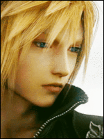
firstly, I'll point out whats working for it: what I really enjoy is the hair, the fine line-work in it by the forehead is working well, the nose has good form with the shade you've given it but all around your shading is good.
")
Secondly, I'll point out whats not working for it: the eyes, you really need to stop outlining the eyelids so thickly, it gives the whole eye no sense of dimension that way, I know you want it to be original and give it your style but you're going to have to find a way around that...the white area around the iris which is known as the Sclera, needs a shading gradient to give it form because right now I don't get the sense of that roundness of an eye...the cheek also use a proper shade to give it more form because it's looking a little flat.
Needs work, but could be a good style to use (3)