
Awards
the first is not too good, it just looks kinda cool =/
this is a little better
You must be registered for see images
this is a little better
You must be registered for see images

its football...I think if you brighten the first one up, it'll look much cooler
2nd one is really cool .....not sure what it is...
u mean vince?just sad he was alot of injut (or how it spelds) last year


i agree, the first one is not so good. i didn't spend much time on it.first one is too dark, and text is too big, and it doesn't need that space, you can just make it smaller and use a better font and place it somewhere close to the render, it seems that you used a texture, correct me if I'm wrong, vectors weren't really needed IMO 4/10
second one has a better depth, better flow, but the render doesn't blend, you ruined it by stroking, almost ruined it 5/10
third one has better depth, but the splatters aren't really needed, you stroked the render again, no blending, too dark, no lightsource, text should be smaller and placed close to the render 3/10
 )
)


Nice Aspecial The First Onethe first is not too good, it just looks kinda cool =/
You must be registered for see images
this is a little better
You must be registered for see images
actually my sigs doesn't have a stable style, so you can't judge my style cuz I'm not stuck into one yeti agree, the first one is not so good. i didn't spend much time on it.
when i did the second and third, i wasn't going for "flow". Thats why I did the stroke. The stlye that I was going for dosn't require everything to be smudged together (like in ur sigs


the first one is awesome O_Othe first is not too good, it just looks kinda cool =/
You must be registered for see images
this is a little better
You must be registered for see images
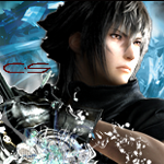
how bout the one i just posted?the first one is awesome O_O
needs a more apparent light source. a slight glow from behind would create depth and lighting.ok, i did this one with depth anf flow in mind. I think the main pic stands forward with the outer glow and bluring, to create depth. there is a little more flow beacuz the colors are all blue-ish and blend together. There is also some lighting if u notice.
You must be registered for see images
what do u guys think?
there is some of that right now. when i put more light, the clouds of blue(u cant see it too well) became more apparent. it looked kinda silly =/needs a more apparent light source. a slight glow from behind would create depth and lighting.


One thing,when you make the text put it nearer the focal and use one simple font like the Birht of a hero and one which is more like handwriting the effect is betterok, i did this one with depth anf flow in mind. I think the main pic stands forward with the outer glow and bluring, to create depth. there is a little more flow beacuz the colors are all blue-ish and blend together. There is also some lighting if u notice.
You must be registered for see images
what do u guys think?
i see, i might do that next time.One thing,when you make the text put it nearer the focal and use one simple font like the Birht of a hero and one which is more like handwriting the effect is better


