[Photoshop] Soraka-League of Legends

-Carnage-

Sannin of the Scrolls 📜
Elite
Joined
Jul 4, 2012
Messages
8,222
Reaction score
661
2'nd smudge signature attempt :sweat:
i think it's definitely better than my first smudgy.

i really like this style, so constructive criticism would be great ^_^
i wanna learn about the art of the smudge :scorps:


You must be registered for see images

You must be registered for see images


Last edited:

Roby

Legendary Shinobi 🐸
Supreme
Joined
Jun 16, 2012
Messages
34,019
Reaction score
1,266
Looks nice Carny ;)
 

Crocodile

Anbu Operative 🎭
Veteran
Joined
Apr 29, 2011
Messages
3,547
Reaction score
1,366
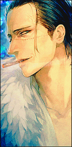
Using too many adjustments on soft light. It also looks empty on some parts of the sig.
Looks good, I don't think there was a need to put "carnage gfx there" but okey.
 

Silico

Banned
Legendary
Joined
May 26, 2012
Messages
14,626
Reaction score
1,665
Hm.

I'm having difficulties picturing a focal here.

You must be registered for see images

I marked some points that i find are taking to much attention from the render and the text. Almost making it four focals on this tag. So yeah, calm down with the highly concentrated colours at some points. Also by using so many soft light layers, or w/e you used the colours are starting to get dq. Naturally.

Anyway the biggest problem on this isn't that. It's the lightning. Imma point out why:

You must be registered for see images

All those spots are reflected(i guess the render had those). But there ain't no lightsource that matches these reflections in the tag.. Anywhere. So that a pretty big mistake. When i work with a render i always check if it has any reflections on it already. That way i can easily make my own lightning sources, according to those reflections. If i don't want to do that BURN the reflections, but always have a copy of the un-edited render. Just in case you burn to much or mess up..

I feel the render should've been bigger also. Not fond of the placement. Or maybe the tag canvas is to big itself.

Text is good :). But as Crocodile said i find the text saying Carnage GFX unnecessary >_O.

One more thing. It lacks effects(fractals) x(.
 

-Carnage-

Sannin of the Scrolls 📜
Elite
Joined
Jul 4, 2012
Messages
8,222
Reaction score
661
agh, I'll go fix it now :sweat: thanks skorm and crocodile
i guess i was too focused on trying to smudge the background and such (T3T)
smudgy's are a pain in the ass, lol

EDIT:
ugh. NVM :sweat:
next time i should really smudge the colors in different layers, now i cant fix it >_<
derp.
 
Last edited:

Wanheda

Sannin of the Scrolls 📜
Elite
Joined
Jan 25, 2013
Messages
5,381
Reaction score
199
Copier with the league of legends ;P I like it tho =S
 

TheLastSamurai

Anbu Operative 🎭
Veteran
Joined
Dec 29, 2011
Messages
4,521
Reaction score
295
also noticed those above mentioned small mistakes, I think you're first one was better than this one :p
 

-Carnage-

Sannin of the Scrolls 📜
Elite
Joined
Jul 4, 2012
Messages
8,222
Reaction score
661
also noticed those above mentioned small mistakes, I think you're first one was better than this one :p

hah, well yeah
but in terms of smudging, i think i did better in this one :sweat:
 
Top