Awards

i havn't been posting most of the stuff i have done latley, so i decided to post some of it here...
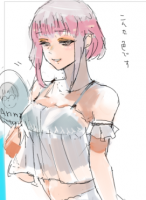
This was fur an SOTW, but it never got entered because of bibi -.-
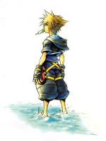
some manga colorings (in order of when i finished them...
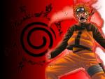
some sigs with manga colorings....
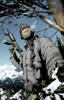
and a cool pic i made a while ago...
You must be registered for see images
You must be registered for see images
You must be registered for see images
You must be registered for see images
You must be registered for see images
This was fur an SOTW, but it never got entered because of bibi -.-
some manga colorings (in order of when i finished them...
You must be registered for see images
You must be registered for see images
You must be registered for see images
You must be registered for see images
some sigs with manga colorings....
You must be registered for see images
You must be registered for see images
and a cool pic i made a while ago...
You must be registered for see images