Gonna give CnC here, since i am your sensei after all xD.
First of all, colours are nice but at some parts the purple colours are to powerful on a small space, and not spread out. Can't point at the areas since i don't have P.S myself atm but i mean at the text and the purple flames above the creatures hand on the bottom.
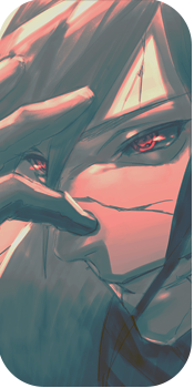
One major thing that is slightly pity is that it actually looks kinda Lq, depth is there but i feel as the blurred out parts are blurred out to much, and the other parts may be slightly to sharp..
Lightsource is obviously on the top right, and i can't find any flaws in it. Well except one thing, and that is a root or something to the left of the creatures right arm. It's to well lit, and should be getting some kinda shadow from the creature. Unless ofc it is a self-glowing part. Ionno.
Text is placed good, but bad. Colours are wierd on it, and the purple-black gradient makes it hard to read the last letters in the text.
You've blended the render with the stock good!
So overall it's nice, looks lq text is bad but blends well lightsource is almost flawless. Keep going!


")