You are using an out of date browser. It may not display this or other websites correctly.
You should upgrade or use an alternative browser.
You should upgrade or use an alternative browser.
[Photoshop] Worked All Night, 4:30 Am - Give me advice! New Signature!
- Thread starter Cascade
- Start date
More options
Who Replied?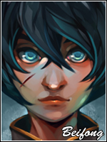

- Joined
- May 10, 2012
- Messages
- 1,469
- Reaction score
- 327
the text ruined the first one
i completely disagree
Instead of a purple fractal you should have used a green one which fits with his eyes (the render),
other then that you did a nice job and it looks like I got a fellow student to compete with xd
nah the greens always looked so similair with the blue and made it completely monochromatic :/
and yes, etenity, i agree with what you said
") still nice tho xD
still nice tho xD
- Joined
- Apr 27, 2012
- Messages
- 1,243
- Reaction score
- 110
Nice job for once, not feeling the text so much....
I'd like to see a sig made with your abilities though without help from others
I'd like to see a sig made with your abilities though without help from others

- Joined
- Nov 28, 2010
- Messages
- 2,772
- Reaction score
- 570
Man you've improved a lot! This definitely is your best sig yet, great job! What I would suggest to make it better is to recolour those fractals, sparks(purple things to the left) to either a shade of blue or green to go with the flow of the sig. I also think that you should change the font of the text to add flow. Other than that, I like it!
- Joined
- May 10, 2012
- Messages
- 1,469
- Reaction score
- 327
thankyou very much for the feedback <3Man you've improved a lot! This definitely is your best sig yet, great job! What I would suggest to make it better is to recolour those fractals, sparks(purple things to the left) to either a shade of blue or green to go with the flow of the sig. I also think that you should change the font of the text to add flow. Other than that, I like it!