[Photoshop] WIP Character Concept.

CasualMisfit

Regular
Joined
Oct 11, 2008
Messages
1,622
Reaction score
662
Here are a few things i think you should do;

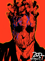
Add the slight neon effect you have going at the edges of the clouds. Not as bright as on the scythe, but it should be there. Kinda gets more atmo.

Don't know why, but i felt that there should be small soft cracks in the grey background. Just came to mind O__o.
The neon lights on the round shapes on his chest goes in to eachother a lil to much, would be nice if you erased and gave some space between the neon lights. Here let me show;
You must be registered for see images

I marked with black rectangle boxes, and showed with a simple marker where :)

The grey part to his right(in our perspective of view) also needs some blue lines, feels needed imo.

Currently, that's all i can think of atm. Love your work my friend, keep it up! ;D
Also, your logo CM, is epic U_U

Thanks for the advice! ;) It's still very much incomplete but I'll bear your thoughts in mind! :D
 

Supermacaquecool

Anbu Operative 🎭
Veteran
Joined
May 17, 2012
Messages
3,432
Reaction score
503
Yup the manga is still in production. Will be ready to go this year around summer. It's had a few set backs mostly on the business side of things but it will be here soon enough! ;)

There's a few things posted regarding it's production on my deviantArt

Yeah it's always a good idea to watch what's happening around what you're drawing... like... where the eyes are in relation to ears, mouth, hairline... etc. :)

Here's a quick tip... It's common for the eyebrows to be roughly on the same level with the top of the ears when a subject is facing straight on.

Lemme sketch you a quick example... gimme a sec

You must be registered for see images

Something like that... bear in mind that the height of the ears in relation to the eyes will change depending on the tilt of the head.
Oh, I see. Never noticed about that stuff regarding eyebrows, but I need to get more practice regarding observation...I'm learning tho xD Little by little (cool sketch by the way. Real helpful).
It's cool to hear you're getting on the manga business soon enough. Dunno about the plot (naturally xd), but your work has pretty gud art. I've seen the starts of my fav mangakas and they were pretty rough regarding that department. YEars of practice I suppose :p
This promo is very appealing:
Lots of detail there, but it's not messy (gotta love dat hair).
I saw you have two mini-animations there:
I don't have much practice on dat, but I got a grasp of the technical fundaments of animation, and I think is pretty gud for a practice. Just some little suggestions if you want them: Well, that piece of cloth had a gud Follow Through the firs 7 frames, but I feel it raises too quick and suddenly. Maybe a little more of anticipation would help (ya see on frame 10 it's is waving, but would seem like it was due the previous move and not the power). IF ya look at it closely it would almost look like it frozen some seconds before rising.
Then, after the whole explosion frames look a tad rushed. Just saying:mew:
 
Last edited:

Yugure

Sannin of the Scrolls 📜
Elite
Joined
Nov 11, 2010
Messages
8,525
Reaction score
731
Darn, that's awesome!
 
Top