1&2: A bit boring, nothing much going on really..
3: Better, a good colouor commbination, and more going on. But i still find it a bit "action-missing"
4: Really nice colours, good blending. Text needs more blending though, it looks like it's just been but above all the adjustments layers..
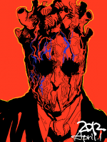
5: Extremly nice, only thing that ruins it is the "dull" filter ontop.. It looks like the colours been covered by a 90&transparent mud xd.
1&2: Yeah, I agree... though 2 is a bit better IMO
3: Didn't know where to add more action, cuz I didn't want to destroy the kind of peaceful atmosphere...
4: I'm a real noob with text. just started to make sigs with text... so I can live with that for now xd
5: -.-* that was a sneaking process... when I noticed it, it was allready too late

tried to fix it and I'm going to upload it...
Thanks for all the advice man
1 is pretty nice, but nothing is going on in the background.
But light, render placement and text are ok.
When you compare to 4 where render placement is off, or 2 and 3 where text and lightning are off too or 5 that could of been pretty nice, but we can't see any details because of the filter.
So i would suggest you to focus on
lightning, rule of third to help you render placement and depth....
have fun!
1: thanks and I agree it's a bit too boring...
2: I don't see those problems
3: Yeah lighting could be better and text=weakness...
4: A bit more cetered would be nice but I don't think it's too bad...(?)
5: I completely agree!
Thanks for advice, I'll try to improve the things you mentioned
They are all good, very clean and colorful
Thank you