You are using an out of date browser. It may not display this or other websites correctly.
You should upgrade or use an alternative browser.
You should upgrade or use an alternative browser.
Very Weird :/
- Thread starter Azu
- Start date
More options
Who Replied?
- Joined
- Oct 31, 2012
- Messages
- 15,554
- Reaction score
- 1,857
I like it.
- Joined
- Aug 12, 2012
- Messages
- 3,594
- Reaction score
- 288
Incredible depth . I think you can lighten up on the blur a tiny bit more though .

- Joined
- Mar 12, 2014
- Messages
- 4,211
- Reaction score
- 568
its awesome!

- Joined
- Mar 27, 2014
- Messages
- 6,442
- Reaction score
- 607
I like it.
Glad you do. xD
Incredible depth . I think you can lighten up on the blur a tiny bit more though .
Mhm... You are right! Will do that! Thanks! xD
its awesome!
Thanks!
Weird things are always good. Nice job Azu-chan.
Thanks Hiei-sama! :bouncy:

- Joined
- Mar 27, 2014
- Messages
- 6,442
- Reaction score
- 607
I might be getting old for this, but what did you do? with the resources?
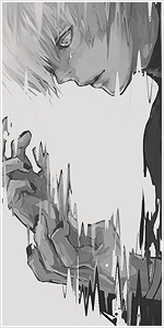
First, I rendered parts of various artworks, then I manipulated and adapted them to look good as separate parts; I paid a lot of attention to the details because this is originally 900x300 size, so much bigger than the one you see here; Then I placed the focal and start placing the elements, render some more material, removed some parts, add some more... And well, really the process is similar to classic photomanipulation but instead of real life elements I decided to work with this type of material.
You must be registered for see images
Zoom in to see the details:
You must be registered for see links
You can't blur that much because then the focus goes on the leaves.
Good jobs anyways Azu
Yosh, understood! xd
Thank you! *_*

- Joined
- Mar 17, 2011
- Messages
- 12,892
- Reaction score
- 909
Well, my dear, the thing is, When you say you are crediting the owners of resources (and posted a link in front of it), I thought you will be linking the resources and not the same artwork again.
I am assuming you are O3A on deviant art? Nice piece of work. I especially liked the dark and white theme, down the middle. It would have been more impactful if you had done the text in a similar way (with the same dark-bright theme).
Also, blur is usually done to show depth and to focus on the two people in between, but for some reason that is not happening here. I can't put my finger on it, is it over blurring? or did you use some other kind of blur? or is it because of its width? I may be wrong though.
But other wise nicely done. Good Job.
- Joined
- Mar 27, 2014
- Messages
- 6,442
- Reaction score
- 607
Well, my dear, the thing is, When you say you are crediting the owners of resources (and posted a link in front of it), I thought you will be linking the resources and not the same artwork again.
I am assuming you are O3A on deviant art? Nice piece of work. I especially liked the dark and white theme, down the middle. It would have been more impactful if you had done the text in a similar way (with the same dark-bright theme).
Also, blur is usually done to show depth and to focus on the two people in between, but for some reason that is not happening here. I can't put my finger on it, is it over blurring? or did you use some other kind of blur? or is it because of its width? I may be wrong though.
But other wise nicely done. Good Job.
@Bold Lol Darl, I linked the same artwork on DA with description /hint: scroll down and in description you have links of resources that I've used that are not rendered and adapted by me. Resources that are rendered and manipulated by me I didn't upload but I put links of the places where you can search for the same or similar artworks and do the same as me. I think that's enough.
@Italic Yes, I am O3A on DA. *_* My texts suck in general, but I'll try to improve. u_u
TBH blur looks nice to me in its original size (900x300) but when the whole tag is in this size from some reason it looks damn weird. + I do think I maybe overdid blur, but yeah...
Thanks a lot. I love you for leaving CnC. :bouncy:
Thanks.