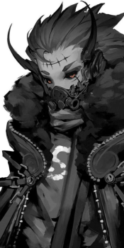
[Gimp] Urahara sig
- Thread starter Tao
- Start date
More options
Who Replied?


nice
thanksVery nice

yeah i think i got how to use all that stuff by now, but i still have some problems to find the best arrangement... thanks thoughdef not bad...it a lil empty and a bit messy but other then that good job
Wow thank youyou're really good man xd...you're blending is perfect xd....i give this a 10/10 xd
I tried to fix the light but screwed up so i just kept it that way xd and thank youI think there's a little bit too much light between his shoulder and hand... else it's awesome!
thanks. i added that to add some depth... don't know if successfull though ^^it is good but i would getrid of that black it just does not go well with the sig and makes it like a rating of 6/10

welshfan2k11
Member


yeah it's a great render! thanksI love the colors Especially the Awesome pose Urahara is in, Brilliant-work
maybe a little bit xD thank youIt's really bright but good work.


assasinitachi123
Member


thanks. I'll use that advise next timLooks good bro, a bit more smudging will make it perfect instead of having everything sharpish.
It's very nice.
thank you guysawesome... long time since i saw a siggy of himmmm
true...a bit too bright lol

Awards

The black and the brightness together is really weird and mess up the sig and then the black is also transperant on some spots which makes it look even weirder. When ignoring the black its an awesome sig from what I see now
(btw: the black is that a C4D?)
(btw: the black is that a C4D?)
thanks for the feedbackThe black and the brightness together is really weird and mess up the sig and then the black is also transperant on some spots which makes it look even weirder. When ignoring the black its an awesome sig from what I see now
(btw: the black is that a C4D?)
after removing the black parts (yeah it's a C4D) i think your right though it seems a bit empty now...