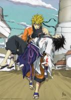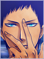
[Photoshop] unfinished finished sasuke sig

-Yard-

Legendary Shinobi 🐸
Supreme
Joined
Jan 13, 2011
Messages
25,264
Reaction score
1,349
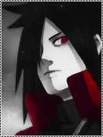
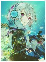
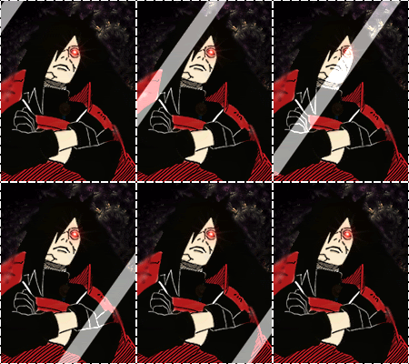
So I got bored and decided to make a sasuke signature for my bio. I need an opinion on which one looks better to see which one I should continue working on instead of making two.


You must be registered for see images


You must be registered for see images

any tips would be great as well.

 

Migualon J.J.

Legendary Shinobi 🐸
Supreme
Joined
Nov 14, 2010
Messages
23,222
Reaction score
646
2nd one, and since you were bored you could have finished my sig ya know? :p xd:D
 

Iqus

Jōnin Strategist 🧠
Regular
Joined
Feb 5, 2009
Messages
1,015
Reaction score
75
The first one is better ...the colours match better
 

blackbird31468

Anbu Operative 🎭
Veteran
Joined
Sep 1, 2010
Messages
2,751
Reaction score
59
the 1st one looked nicer, but the 2nd look more like it fit sasuke.
 

Dino

Jōnin Strategist 🧠
Regular
Joined
Apr 2, 2011
Messages
1,818
Reaction score
698
The first one appeals to my eyes more but the second one fits sasuke best.
 

-Yard-

Legendary Shinobi 🐸
Supreme
Joined
Jan 13, 2011
Messages
25,264
Reaction score
1,349
Crap xd I might just finish both then.
 

Mugiwara

Kage in the Making 👑
Legendary
Joined
Apr 25, 2008
Messages
11,629
Reaction score
1,783
The scanlines ruined the already ruined signatures.
Size: Bad
Text: Horrible
Background: Horrible
Colors: Horrible
Blending: Just shoot me
Contrasts: Non-existent
 

Iqus

Jōnin Strategist 🧠
Regular
Joined
Feb 5, 2009
Messages
1,015
Reaction score
75
The scanlines ruined the already ruined signatures.
Size: Bad
Text: Horrible
Background: Horrible
Colors: Horrible
Blending: Just shoot me
Contrasts: Non-existent

You sound like Pesh:whoa:
 

Yugure

Sannin of the Scrolls 📜
Elite
Joined
Nov 11, 2010
Messages
8,525
Reaction score
731
You sound like Pesh:whoa:

it's Pesh on his account, Joking;)

I think the first one is better, because the colors matches... but the scanlines are aweful...
 

-Liquid Cefka-

Anbu Operative 🎭
Veteran
Joined
Dec 10, 2010
Messages
3,818
Reaction score
173
definately the 1st one. it looks smoother i guess.
its a little big though, but i like it
 

Inch

Kage in the Making 👑
Legendary
Joined
Apr 28, 2011
Messages
11,124
Reaction score
313
The pattern lines really flatten Madara's face. Either erase some of them, or better yet, all of them. Then reduce the height of the sig. Then put some c4d/effects/brushing around the edges of Madara's mask with a lower opacity the further they come in.
 
Top