You are using an out of date browser. It may not display this or other websites correctly.
You should upgrade or use an alternative browser.
You should upgrade or use an alternative browser.
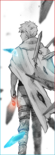
[Photoshop] Ulquiorra - Sig
- Thread starter Marimo
- Start date
More options
Who Replied?

- Joined
- Nov 7, 2012
- Messages
- 38,233
- Reaction score
- 3,030
Green ^
Red ^
my pants is white tho
Red ^
my pants is white tho


- Joined
- Apr 21, 2012
- Messages
- 16,406
- Reaction score
- 742
Nice
I have no idea how you even made the C4Ds look like that >_O
I have no idea how you even made the C4Ds look like that >_O

- Joined
- Aug 5, 2012
- Messages
- 18,426
- Reaction score
- 521
Almost look like my old ava Lol
You must be registered for see images

- Joined
- Apr 24, 2012
- Messages
- 3,192
- Reaction score
- 256
British accent? xDNoice!
I like the c4d placements >_O
Thanks [:
Eh?Green ^
Red ^
my pants is white tho
Thanks :3This is why I can't have nice things...
Love it.
Yeah that one, I agree with you but the depth of the tag looked so much better with it there.It looks good but the one thing i dont like it that 1 bit of c4d thats covering his arm near his sword, just looks out of place to me Lol
Practice loads of it, the secret is quite simple though xDNice
I have no idea how you even made the C4Ds look like that >_O
lol yeah the same render [:Almost look like my old ava Lol
You must be registered for see images


Danielgf04
Member
- Joined
- Jun 29, 2012
- Messages
- 2,038
- Reaction score
- 212
Love it! Very nice indeed!

- Joined
- May 1, 2012
- Messages
- 2,646
- Reaction score
- 616
For some reason, the render just looks out of place o_o. Can't really put my finger on it, like, you're making a 3d background with a lot of depth, then there's the 2d looking render and it's just not meshing well for me. You didn't really do anything wrong, I just feel a different render would suit this sig much better :3. Good job overall imo, sorta lacking flow a bit.
- Joined
- Apr 24, 2012
- Messages
- 3,192
- Reaction score
- 256
nice! looks awesome. and ulquiorra is awesome xD
Love it! Very nice indeed!
Thanks guys. :]daaamn u r pro at this man...
Yeah I know, it's because ulquiorra always wears white that it is a miss-fit here and I agree that a different render would suit the sig much better but what you're looking at is my attempt to create a bg for the render and not the vice versa.For some reason, the render just looks out of place o_o. Can't really put my finger on it, like, you're making a 3d background with a lot of depth, then there's the 2d looking render and it's just not meshing well for me. You didn't really do anything wrong, I just feel a different render would suit this sig much better :3. Good job overall imo, sorta lacking flow a bit.
Thank you for the cnc, I really appreciate it.
")

- Joined
- Feb 17, 2012
- Messages
- 1,897
- Reaction score
- 723
Nice job Marimo, I do see a few things that don't help this tag reach its full potential though. The first thing would be the flow of the c4d's, they don't really match the flow of the render so it gives off that messy kind of feel to it.
The next thing would be the lighting, whilst green does fit with the render it looks unrealistic if you get what I mean. Some green lighting on the render would help reduce that look and would also help with blending.
You could also make the render really standout some more with some dodge/burn. Mainly in the areas where the green lighting in the background is, so that the render matches the intensity of the lighting.
With the c4d's that you have placed in front of him they don't really fit in those spots. Something seems off about them there, it does help with adding depth but you could make it even better. Try not placing the left one over his arm, instead try lowering it and go from the lower left corner and across his belly(not too much over his belly though.)Then filter>blur>blur more, the one on the right is fine but blur that one as well to match the one on the left.
The last thing would be adjustment layers, I'm guessing you have used some but try adding a few more. Play with an exposure and a curves A/L and a few more gradient maps just to help with the overall finish of the tag.
I hope that helps you somewhat as I know awkward c4d's are, especially when making the background out of them. If you want me to clarify anything I said I will be happy to do so, top effort though