[Photoshop] uh another new sig

NarutoGoku

Active member
Veteran
Joined
Jun 7, 2008
Messages
4,270
Kin
0💸
Kumi
0💴
Trait Points
0⚔️
Awards
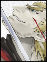
this one looks plain but for some reason i like it >.>

You must be registered for see images
hm =/

i like the style, and the effects are great. The only problem is the balance. On the right there is soo much going on, and on the left, it is kinda empty. I'm not sure if it is possible, but if the render was moved to the left, it would look great^^
 
Top