You are using an out of date browser. It may not display this or other websites correctly.
You should upgrade or use an alternative browser.
You should upgrade or use an alternative browser.
[Photoshop] Uchiha Bro's ..
- Thread starter -Jiten-
- Start date
More options
Who Replied?
- Joined
- May 10, 2012
- Messages
- 45,490
- Reaction score
- 1,676
Really good IMO, though I don't GFX so I cannot give you feedback

- Joined
- Sep 26, 2012
- Messages
- 12,510
- Reaction score
- 418
good job, but it looks better like this:
You must be registered for see images

- Joined
- Mar 7, 2012
- Messages
- 15,610
- Reaction score
- 495
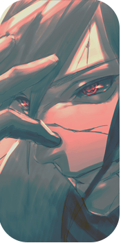
looks awesome but it would be cool if you could put theur MS instead of 3 tomoe
- Joined
- May 26, 2012
- Messages
- 14,626
- Reaction score
- 1,665
Well. This is..
Ok, first off i can't really set my eyes on anything here, since they are in desperate need of finding a place to focus on. So, the major problem is that there's.. Well, let's see here..
1, 2, 3, 4, 5..6! Focals. Holy SHIT O_O, what have you done O_O. Let me point them out, shall i?
Two red eyes in the bg, are executed so near that they feel like a focal when they really shouldn't, since they are in the background.
Two renders(or alas, two characters) makes another two focals. But since they are the focals you really wanted your viewers eyes to focus on, let's call them "Major focals"..
Two texts. Now, this could've been better if you'd actually putted them ontop the "Major focals", instead of scattering them around.
How to fix: Well, since you wanted the tag to contain two "Major focals" i suggest you don't, since i hate that >_O. But, if you really want to, atleast make them into two separate "Side - to - side tags". Let's say you make a two tags, in one. Giving two bg's with a focal in the middle, a border around. Then some space between and then the next one. Best i can describe is, make it look like two avatars, side by side. It'd look so much cooler, and softer on the eyes. Cause then i can focus on the first one, then the next one. Instead of focusing on both at the same time. >_O
Text, well.. It looks like a kindergarten student made it in ms paint(well not really, but it looks pretty bad). As i said, move the text closer/and or ontop of the "Major focals". Also put more time into it, it is a bigger part in the tag, than you might realize.
The bg, well.. If you really REALLY insist having it.. Add depth to it, so you remove the feeling of two extra, unnecessary focals >_O.
Well, tbh i hate the bg, it feels repeated and kinda messy. . .
"Major focals", well what can i say? You've clearly just dodged their faces to such a level that Snow White, would be damned. The rest of their bodies. Well, where the hail are they? Did they dissapear? O_O or was their never there to begin with? O_O(yeah i quoted DBZ abridged..). Also what's up with..I guess Sasuke's bandage? When he awakened the EMS, didn't he remove his bandages? O_O
No lightsources makes the tag look very depressing and dark. Well, i like darkness but i still need a lightsource.
That being said, i can't really point out much other things, since i actually having trouble looking at it >_>.
Oh well, keep practicing and good luck >_O
Last edited: