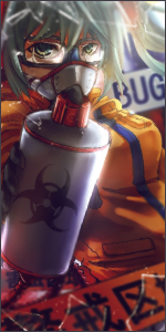
Two sigs I made

〜Angel Reborn〜

Jōnin Strategist 🧠
Regular
Joined
Jul 29, 2011
Messages
1,747
Reaction score
250
Hey I just made two sigs below for kaos555. Well Let me kno what u think :D Plz rank ;)

You must be registered for see images


You must be registered for see images

LOL Me like the last one. I dunno abt the first one xd Its a bit of a learning curve for me - splatter artwork. Heh xd
 

Nathan

Sage of Six Posts 🔮
Immortal
Joined
Mar 26, 2011
Messages
54,373
Reaction score
4,158
Second one, looks better to me.
 

Alternative

Sannin of the Scrolls 📜
Elite
Joined
Feb 27, 2011
Messages
6,482
Reaction score
655
Why are they saved as gifs? xD Save them as pngs.

Only two problems for me which I think you should work on, these are very low quality. Try to find some better quality stocks and renders. is a good one to go to for renders at least.

Second problem is that you're stretching those renders out way too much. Remember to hold shift when you're making your renders bigger ir smaller or they will be proportioned terribly, like they are now.
 

〜Angel Reborn〜

Jōnin Strategist 🧠
Regular
Joined
Jul 29, 2011
Messages
1,747
Reaction score
250
Why are they saved as gifs? xD Save them as pngs.

Only two problems for me which I think you should work on, these are very low quality. Try to find some better quality stocks and renders. is a good one to go to for renders at least.

Second problem is that you're stretching those renders out way too much. Remember to hold shift when you're making your renders bigger ir smaller or they will be proportioned terribly, like they are now.

Alright thanx for the tip ;D I will keep that in mind :)
 

Viole

Anbu Operative 🎭
Veteran
Joined
Aug 11, 2010
Messages
2,549
Reaction score
1,158
xd
i used the same render in the sig i posted yesterday xd
ok first one looks really LQ and the background has allot of read space
second one needs more depth and flow
work on them a bit more
and dont use LQ renders
 

〜Angel Reborn〜

Jōnin Strategist 🧠
Regular
Joined
Jul 29, 2011
Messages
1,747
Reaction score
250
xd
i used the same render in the sig i posted yesterday xd
ok first one looks really LQ and the background has allot of read space
second one needs more depth and flow
work on them a bit more
and dont use LQ renders

LOL I won't use low quality renders. I just used the renders the guy gave xD I didnt bother search for another one. But I will make sure I will get a better one next time :D Thanx Nikolastojke :)
 
Last edited:

Cassiopeia

Legendary Shinobi 🐸
Supreme
Joined
Oct 19, 2011
Messages
33,065
Reaction score
1,201
I liked to playfulness of the 1st.
 

Frozenstein

Kage in the Making 👑
Legendary
Joined
Jun 3, 2011
Messages
11,189
Reaction score
429
the second 1 looks good to me. I really love those kind of renders. goth loli for the win! xd
 
Top