[Gimp] Two Signatures

TheItachiUchiha

Jōnin Strategist 🧠
Regular
Joined
May 14, 2012
Messages
1,093
Reaction score
309
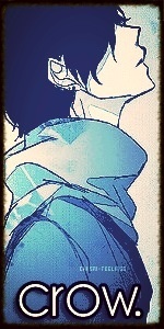
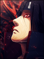
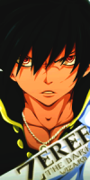
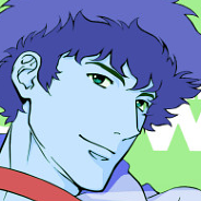
Just made these. Specific criticism and tips would be helpful.

You must be registered for see images


You must be registered for see images
 
Y

YokoKurama

Guest
I really like them both. But the top one looks as if he's blowing cold air outta his mouth. The one with Sakura is simple and I like simple :)
 

Crow.

Anbu Operative 🎭
Veteran
Joined
Nov 10, 2012
Messages
2,533
Reaction score
285
Both are great, but I'd darken 'liberation' a bit. Not too much though.
 

Souji

Kage in the Making 👑
Legendary
Joined
Jul 13, 2012
Messages
12,750
Reaction score
713
Fantastic, I like them both. Could I maybe use the "Liberation" one down the road? (I'm a huge AC fan)
 

TheItachiUchiha

Jōnin Strategist 🧠
Regular
Joined
May 14, 2012
Messages
1,093
Reaction score
309
Fantastic, I like them both. Could I maybe use the "Liberation" one down the road? (I'm a huge AC fan)

Yes you may. I'm a fan too, I didn't even finish AC3 yet though haha.
 

Cypher

Jōnin Strategist 🧠
Regular
Joined
Feb 13, 2013
Messages
1,092
Reaction score
160
there is zero depth or flow involved in either of these sigs so def work on that and the render stick out like a sore thumb so work on your blending and the text is badly placed look up the rule of thirds it will help you organize your work better

everything you did seems random just there to slap stuff down vs planned and placed and you should learn to use blur and shapen funtions they really bring out the focal

aloso learn the dodge and burn tool to really bring out the contrast of an image
 

TheItachiUchiha

Jōnin Strategist 🧠
Regular
Joined
May 14, 2012
Messages
1,093
Reaction score
309
there is zero depth or flow involved in either of these sigs so def work on that and the render stick out like a sore thumb so work on your blending and the text is badly placed look up the rule of thirds it will help you organize your work better

everything you did seems random just there to slap stuff down vs planned and placed and you should learn to use blur and shapen funtions they really bring out the focal

aloso learn the dodge and burn tool to really bring out the contrast of an image

Blending and depth are easily my biggest problems. I do blur, sharpen, dodge, and burn but I guess not enough. How should I go about creating flow?
 

Cypher

Jōnin Strategist 🧠
Regular
Joined
Feb 13, 2013
Messages
1,092
Reaction score
160
Blending and depth are easily my biggest problems. I do blur, sharpen, dodge, and burn but I guess not enough. How should I go about creating flow?

flow is just about keeping everything moving in one direction dont like make the render face left the have everything else going against it....flow isnt requied it just helps it all blend together as one piece

and yes blending and depth are the two hardest things to master and imo blenind is the hardest to get it all perfectly blended

dont worry tho most of us here and learning i was feeling o about my stuff then i saw this on deviant art and almost crapped my pants at how good it is

i did not make this i just found it

You must be registered for see images
 
Top