[Photoshop] Two more tags

-Frost Knight-

Jōnin Strategist 🧠
Veteran
Joined
Feb 24, 2012
Messages
2,037
Reaction score
237
Here's two more tags/sigs following my old ones here:
I had to use limited resources because I didn't have Internet to search for new Images others then then the ones I already had. I ended up using the render I used on my signature an year ago.
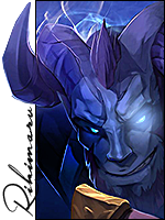
Thunder God:
V.1
You must be registered for see images


V.2
You must be registered for see images

Varian:
One Year ago
You must be registered for see images


Now:
You must be registered for see images
 
Last edited:

Multiply

Kage in the Making 👑
Legendary
Joined
Apr 15, 2012
Messages
12,839
Reaction score
1,034
These are sick bro!
 

Chihaya

Pirate Queen
Veteran
Joined
Apr 10, 2014
Messages
4,185
Reaction score
1,162
Dang, very good O-O Better than I. Love the text and everything. So badass~
 

Sasori

Kage in the Making 👑
Legendary
Joined
May 31, 2014
Messages
15,260
Reaction score
695
Sick avatars bruh
 

-Frost Knight-

Jōnin Strategist 🧠
Veteran
Joined
Feb 24, 2012
Messages
2,037
Reaction score
237
Thanks guys! which one do you guys like the best?
 

Phobos

Sannin of the Scrolls 📜
Elite
Joined
Jan 31, 2011
Messages
8,678
Reaction score
201
First one looks nice, I think it would be even better with second color. V1 text is better since the "god" doesn't go well with the rest of the text in V2.

The second tag I actualy like the first more. Second again, I would use different font for "warrior".
If warrior is strong, fast big etc etc, so should be the font. If you used the same font and said "with love" it would fit more :p
 

-Frost Knight-

Jōnin Strategist 🧠
Veteran
Joined
Feb 24, 2012
Messages
2,037
Reaction score
237
First one looks nice, I think it would be even better with second color. V1 text is better since the "god" doesn't go well with the rest of the text in V2.

The second tag I actualy like the first more. Second again, I would use different font for "warrior".
If warrior is strong, fast big etc etc, so should be the font. If you used the same font and said "with love" it would fit more :p
Thanks for the tip! It took me awhile to do the god but I couldnt find anyway for it to match the rest of the tag. I ended up with a plain white color. And wow, I hate the first one lol, C4Ds look out of place and text looks messed up.
 
Top