You are using an out of date browser. It may not display this or other websites correctly.
You should upgrade or use an alternative browser.
You should upgrade or use an alternative browser.
[Photoshop] True Beauty
- Thread starter Dino
- Start date
More options
Who Replied?

- Joined
- Aug 3, 2011
- Messages
- 3,694
- Reaction score
- 244
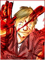
Seems like you oversharpened it a little. I don't like the text or the placement of it. I like the bg. It fits. But needs to be blurred a little. I give it 6/10


- Joined
- Mar 30, 2011
- Messages
- 9,655
- Reaction score
- 356
I like it. It fits with the "Jolly Holly" attitude, I feel.

- Joined
- Feb 27, 2011
- Messages
- 6,482
- Reaction score
- 655
With your predominantly red colour theme going on here, just throwing in that blue lighting at the bottom doesn't really work. It seems like a last minute thing to throw in the blue. Aso that green eye is annoying, doesn't go with the red theme you've gone with. Apart from that, it's pretty good.
I'm not a fan of when people use just a face and a shoulder of a render, it's losing a lot in terms of being able to use flow, and because shoulders are generally broad you're also losing quite a bit in room to use for effects, which is where I thought this could shine the most.
I'm not a fan of when people use just a face and a shoulder of a render, it's losing a lot in terms of being able to use flow, and because shoulders are generally broad you're also losing quite a bit in room to use for effects, which is where I thought this could shine the most.

- Joined
- Jun 3, 2011
- Messages
- 11,189
- Reaction score
- 429
I think it's not bad 