You are using an out of date browser. It may not display this or other websites correctly.
You should upgrade or use an alternative browser.
You should upgrade or use an alternative browser.
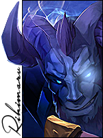
Trafalgar Law Vertical
- Thread starter LitzSabr
- Start date
More options
Who Replied?
- Joined
- Mar 12, 2014
- Messages
- 4,211
- Reaction score
- 568
looks nice
- Joined
- Jan 31, 2011
- Messages
- 8,678
- Reaction score
- 201
Looks good, I guess o:
well blended, text fits
nothing that stands out as bad, but also nothing that stands out as really cool/interesting
imo I wouldn't darken the text that much, there is also nothing interesting under the text- could be cropped a bit
background looks a bit flat
well blended, text fits
nothing that stands out as bad, but also nothing that stands out as really cool/interesting
imo I wouldn't darken the text that much, there is also nothing interesting under the text- could be cropped a bit
background looks a bit flat

- Joined
- Mar 13, 2013
- Messages
- 3,045
- Reaction score
- 226
Thanks.looks nice
Looks good, I guess o:
well blended, text fits
nothing that stands out as bad, but also nothing that stands out as really cool/interesting
imo I wouldn't darken the text that much, there is also nothing interesting under the text- could be cropped a bit
background looks a bit flat
I'm myself satisfied with the text since it goes on with the atmo. Though it's true a bit more of good effects would've been better. Thanks for commenting m8.
Last edited:


- Joined
- Aug 22, 2011
- Messages
- 23,898
- Reaction score
- 1,601
So,here we go:
The lightning is nice but i think different colors would fit more,also i don't like the background.I see what you were trying to achieve the tag is pretty plain,even fractals couldn't save the situation.
Another thing,the right side is pretty dark and the light on his left arm is unusually bright,i mean it doesn't look like it the light is coming from the fire in his arm.You darken render's arm a bit IMO.
The text is nice,i like it.And overall the tag is not bad,really^^much better than all the trash that people post at DS today.

- Joined
- Mar 13, 2013
- Messages
- 3,045
- Reaction score
- 226
So,here we go:
The lightning is nice but i think different colors would fit more,also i don't like the background.I see what you were trying to achieve the tag is pretty plain,even fractals couldn't save the situation.
Another thing,the right side is pretty dark and the light on his left arm is unusually bright,i mean it doesn't look like it the light is coming from the fire in his arm.You darken render's arm a bit IMO.
The text is nice,i like it.And overall the tag is not bad,really^^much better than all the trash that people post at DS today.
True that. The tag is a plain for a reason U_U.
The light is coming from the glowing lights around his arm though I think they do need to glow a little in this case.
nice work man.thx for sharing it.
No problem and thanks.
")

- Joined
- Mar 11, 2013
- Messages
- 5,655
- Reaction score
- 61
looks sweet bro
@Phobos man your avy and sig has my blood pumping at a bad time
@Phobos man your avy and sig has my blood pumping at a bad time