Toukaa (+help pls)

Melodious

Sannin of the Scrolls 📜
Elite
Joined
Feb 11, 2012
Messages
6,612
Reaction score
900
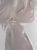
Got bored and colored/painted a manga cap of Touka from TG:re. Not sure how to explain it, but I love the smooth/painty style of coloring so I tried to do that...

You must be registered for see images

(colored on SAI)

Alsooooo... I started this L tag and I'm just stuck. I have no clue where to go on from here, so help would be GREATLY appreciated.

You must be registered for see images


Resources:
You must be registered for see images


You must be registered for see images
 

Mgumbo

Member
Joined
Jan 23, 2012
Messages
264
Reaction score
41
The Touka one looks really nice, I like that style too.
 

Migster257

Anbu Operative 🎭
Veteran
Joined
Jun 26, 2014
Messages
3,546
Reaction score
234
For the tag, you could darken the edges a little bit so that you don't have to spend more time on it.
I wouldn't really recommend that since your tag seems like the type that would not benefit from anything dark.
I'd add text. That would really fit.
You should fix the bottom part of the clock that gets covered by the BG, when the BG is clearly below the blue/pink smudged part, and the clock is over that. It's not really anything major. Just nitpicking.
 

Melodious

Sannin of the Scrolls 📜
Elite
Joined
Feb 11, 2012
Messages
6,612
Reaction score
900
The Touka one looks really nice, I like that style too.

*Claps* That is the best art I've seen this month. *Claps violently*

You must be registered for see images


For the tag, you could darken the edges a little bit so that you don't have to spend more time on it.
I wouldn't really recommend that since your tag seems like the type that would not benefit from anything dark.
I'd add text. That would really fit.
You should fix the bottom part of the clock that gets covered by the BG, when the BG is clearly below the blue/pink smudged part, and the clock is over that. It's not really anything major. Just nitpicking.

Ah, thanks a lot! ;D I think I have an idea for the clock by using textures to somewhat cover it up....
 

Migster257

Anbu Operative 🎭
Veteran
Joined
Jun 26, 2014
Messages
3,546
Reaction score
234
You must be registered for see images


Ah, thanks a lot! ;D I think I have an idea for the clock by using textures to somewhat cover it up....
Exactly what I was gonna say actually. I just edited textures out since I thought that the tag was already really nice.

What adjustment layers do you use? I think I know how to replicate it, but whenever I do a sig/tag/avatar like this, people say it looks too simple.
 

suki

Anbu Operative 🎭
Veteran
Joined
Feb 9, 2013
Messages
4,357
Reaction score
807
woooow

well done <3 :ilu:
 

Antichrist

Banned
Supreme
Joined
May 16, 2014
Messages
20,732
Reaction score
683
The sig is nice ... I like it

Good job on coloring .
 

suki

Anbu Operative 🎭
Veteran
Joined
Feb 9, 2013
Messages
4,357
Reaction score
807
I'll be honest, I thought you and Melodious were the same person with the name changed. You guys have really similar styles.
Haha... I learn a-lot from Melody-chan, she's like a teacher to me. I might not ask her directly how to do things, but just visualizing her work, I can try my best to produce that perfect simplistic style she has. Oh, and I only request from her.

I know this gone off topic but i can't resist replying so i hope nobody minds xD

Keep it up melodyyyy ;) :D
 
Last edited:

Hei

Supreme
Joined
Aug 22, 2011
Messages
23,898
Reaction score
1,601
I wish results of my bored were the same as yours lol
The coloring is simply nice, few things that you could change are the eye color and get rid of the text.
As for signature..i won't comment it as it is not completed but there is potential for being really great tah just get over laziness >.O
 

Goetia

Legendary Shinobi 🐸
Supreme
Joined
Mar 12, 2014
Messages
34,484
Reaction score
1,419
They look really good. Although, I think the tag for L is a little bright for...well, a character such as L. But that's just me, the work you've produced is well done anyway.
 

Melodious

Sannin of the Scrolls 📜
Elite
Joined
Feb 11, 2012
Messages
6,612
Reaction score
900
Exactly what I was gonna say actually. I just edited textures out since I thought that the tag was already really nice.

What adjustment layers do you use? I think I know how to replicate it, but whenever I do a sig/tag/avatar like this, people say it looks too simple.

Usually, I start off with a lot lot lot of gradient maps (for me, usually on lighten, screen, or luminosity). Then, I mess with the curves, brightness/contrast, and selective color. (but obviously I didn't do ALL of that on this one since it's unfinished) Haha, sometimes it's not a bad thing! (but other times, it can get too simple..) Simplicity is my forte B)

woooow

well done <3 :ilu:

The sig is nice ... I like it

Good job on coloring .

I wish results of my bored were the same as yours lol
The coloring is simply nice, few things that you could change are the eye color and get rid of the text.
As for signature..i won't comment it as it is not completed but there is potential for being really great tah just get over laziness >.O

They look really good. Although, I think the tag for L is a little bright for...well, a character such as L. But that's just me, the work you've produced is well done anyway.

Thanksss guys! c:
 
Top