So...???
Expulso Jōnin Strategist 🧠 Regular Joined Jun 12, 2012 Messages 1,436 Reaction score 172 Aug 18, 2012 #1 You must be registered for see images So...???
gordo1 Anbu Operative 🎭 Veteran Joined Jun 15, 2012 Messages 4,666 Reaction score 351 Aug 18, 2012 #2 There's not a continuous flow (which is something I struggle with also), but it's really cool. I like it a lot.
There's not a continuous flow (which is something I struggle with also), but it's really cool. I like it a lot.
-The Agent- Anbu Operative 🎭 Veteran Joined Oct 27, 2010 Messages 4,511 Reaction score 593 Aug 18, 2012 #3 
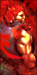
It's good but it could be better. I feel like there is too much going on in the sig.
stylow Member Joined May 21, 2012 Messages 87 Reaction score 15 Aug 18, 2012 #4 Very cool man although my editing differs very much from yours though i like yours better
Hipster Madara Kage in the Making 👑 Legendary Joined Mar 13, 2010 Messages 16,212 Reaction score 1,556 Aug 18, 2012 #5 Too many effects...
Yuka Sannin of the Scrolls 📜 Elite Joined Aug 29, 2011 Messages 6,485 Reaction score 1,056 Aug 18, 2012 #6 I love the bright colors, Nice-work
ForgottenHero23 Member Joined Apr 11, 2012 Messages 251 Reaction score 21 Aug 18, 2012 #7 You must be registered for see images Heres mine that is simple and I did it like in 15 minutes so its not that great
You must be registered for see images Heres mine that is simple and I did it like in 15 minutes so its not that great
Kiba21890 Leaf Village Regular 🍃 Regular Joined May 1, 2011 Messages 638 Reaction score 60 Aug 18, 2012 #8 I think it's Bad Ass Yo.
Temporary Account Jōnin Strategist 🧠 Regular Joined Aug 13, 2012 Messages 1,162 Reaction score 134 Aug 19, 2012 #9 Flow is inconsistent. I recommend that you screen most of your layers.
Titania Erza Anbu Operative 🎭 Veteran Joined Mar 15, 2012 Messages 3,726 Reaction score 690 Aug 19, 2012 #10 Its hard to explain but teh sig doesnt feel as a whole thing. The blue fractal doesnt blend with the orange lighting in the BG which makes the sig too busy
Its hard to explain but teh sig doesnt feel as a whole thing. The blue fractal doesnt blend with the orange lighting in the BG which makes the sig too busy
Cascade Jōnin Strategist 🧠 Regular Joined May 10, 2012 Messages 1,469 Reaction score 327 Aug 19, 2012 #11 uve just slapped some fractals onto a coloured manga panel IMO the flow is quite wrong :/