- Joined
- Mar 15, 2012
- Messages
- 3,726
- Reaction score
- 690
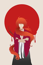
I made this one a couple of months ago, but I forgot to post it here on NB
Let the floods of CNC start
Let the floods of CNC start
You must be registered for see images


Thankslooks cool
your ava even cooler
tho the sig is the coolest
lol, tnxNo words
Jusht:sasuke::yayy::ls:
flowers
Fair enoughI don't like dat bordering. The rest is awesome
, tnxThank youDat Erza 5/5
Nope not really, I just messed up a little bit. I first had the tag cropped like the borders indicate, but then I decided to make the tag a bit wider. After making the tag a bit wider, I saved the tag as a PNG and closed PS. With no PSD-file and the border still on the original place I just decided to leave it there in the hope that other people would like it XDthat is not bordering it's adding shadow to the layer that's cut from original pic something like that am i correct he he
any way G8 work keep it up....


I absolutely love it! Just wondering what the yellow on her breast was needed for?
. I made this one for some people on a GFX-forum to learn them how to CnC. Even after I said in the OP that the floods of CnC should be starting. I was kinda surprised that nobody saw through them.Hmm... Where to start,
Background: I personally don't like the bg, there's too much going on in the bg, and it ruins the flow abit
Blending: I can see you made efforts in blending, but it's still not well blended, mainly because of the bg, you could've used Selective Color, or Color Balance to fix the blending, but that's not the best advicexd
Lighting and Depth: I see multiple light source, why is that? I think the lighting is messed up, and it could've added to the depth if it was well done, speaking of depth, I think it's okay, but some dodge an burn tool here could've nailed it.
What else? Ah! It's over saturated and the render might've been a little bit too sharped, and personally I'd have gone with a different color scheme, if I were you... Red is too strong for a female characterxd Text placement is okay, although a little closer to the focal would be nice, and the font used for 'Scarlet' is not the best choice, but then even I make that mistake sometimes, the drop shadow opacity needs to be reduced, and more experiment with blending option would make the text awesome. Finally, sig is too long:heh: But just so you know I rearly make sigs these days

It looks awesome
Nice job on the colours
I CnC a guys sig a while back, and he started flaming at me, so because of that, I'm very careful not to hurt someone's feelings in the name of CnC, and I didn't comment on most things because I assumed a Gfxer of your caliber would see the mistake, and you would've told me the reason you made the tag, and I'd have written a wallie@_@