[Photoshop] The Golden| Minato Sig
- Thread starter Drizzy
- Start date
More options
Who Replied?


Thanks, I'll see what can happen about the text.Nicely done.. this is mainly expected from you Drey, work on the text you can't really read it well.


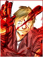
The idea was to make the edges soft so it looks like the render is floating, I don't normally exceed 400 pixels for the width.This is different.
You have floating head syndrome, should've made the length a bit more.
The text isn't very good but otherwise it's nice.")
Thanks.


Awards


I don't like the font, but it's just my opinion towards the font xd It's awesome, but the text seems odd to me.
I don't like the font, but it's just my opinion towards the font xd It's awesome, but the text seems odd to me.
Thanks.i think you overdid the feathering or erasing , because now i can see the rocks behind him throw his shoulder
other than it's pretty cool

