- Joined
- Sep 26, 2012
- Messages
- 12,510
- Reaction score
- 418
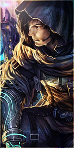
Here is a new tag, hope you like it:
You must be registered for see images
I'll do it next timeNice.
I wish you would have added a little more red though. To bring out his goggles.

whats it made off??

")