
[Photoshop] -~-~-~ Tags ~-~-~-

-Frost Knight-

Jōnin Strategist 🧠
Veteran
2,037 posts 237 reactions
Joined
Feb 24, 2012
Messages
2,037
Status
Activity Streak
Hey guys^^

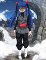
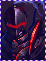
I made a couple sigs and I decided to share it with you all.....So I got a lot of CnC on a GFX forum and I decided to make a V.2 of it,

V.1
You must be registered for see images


V.2
You must be registered for see images


You must be registered for see images


And last and least....
You must be registered for see images


And I know the Itachi one is horrible, I tried something new and it didnt come as I hoped....


CnC all welcome

 

FireBird Marco

Anbu Operative 🎭
Veteran
2,590 posts 226 reactions
Joined
Jan 1, 2013
Messages
2,590
Status
Activity Streak
I can't even see Illidan dude!
 

chad062388

Anbu Operative 🎭
Veteran
2,749 posts 238 reactions
Joined
Jan 8, 2011
Messages
2,749
Status
Activity Streak
Illidan looks great
 

Crow.

Anbu Operative 🎭
Veteran
2,533 posts 285 reactions
Joined
Nov 10, 2012
Messages
2,533
Status
Activity Streak
All three are epic. ^.^
However, the writing 'itachi', the It looks like an H..?
 

two fates

Jōnin Strategist 🧠
Regular
1,380 posts 103 reactions
Joined
Apr 12, 2012
Messages
1,380
Status
Activity Streak
nope, itachi look awesome. good job
 

-Shiro-

Sannin of the Scrolls 📜
Elite
6,391 posts 477 reactions
Joined
Sep 3, 2012
Messages
6,391
Status
Activity Streak
?isnt that carnages pic of itachi?
 

Trollo Lucilfer

Kage in the Making 👑
Legendary
12,510 posts 418 reactions
1
Joined
Sep 26, 2012
Messages
12,510
Status
Activity Streak
-Halo tags:
First one, i don't like U_U
Second one, i like :win:
-Illidan:
It's not bad at all :D
-Itachi:
It looks good, but the C4Ds don't match U_U i mean the Itachi render looks pink and the C4Ds are more like fire and stuff, and the text is large, other than that, it's a good tag :D
 

-Carnage-

Sannin of the Scrolls 📜
Elite
8,222 posts 661 reactions
1
Joined
Jul 4, 2012
Messages
8,222
Status
Activity Streak
first one v.2:
its better
good focal
but u overused the c4d's, it looks messy to me...and the effects are completely random
the overall sig is cool fk..i like it

second one:
its good
the effects seem overused..so i can hardly notice the render,
the text is ok,..needs more effort put in it,
what i hate about the sig is that u went crazy with effects, therefore created alot of focals...

itachi one:
i dont like it..
looks like all u did was put a bubble c4d as the background
and added some random effects in front of the render...and only in the front..which is one of the reasons the sig has no blending
as for the text..its terrible..doesnt match the theme of the sig(if it has one) ...again,no blending to it

ur improving fk good job
 
Top