You are using an out of date browser. It may not display this or other websites correctly.
You should upgrade or use an alternative browser.
You should upgrade or use an alternative browser.
[Photoshop] Tōshirō Hitsugaya
- Thread starter Aenigma
- Start date
More options
Who Replied?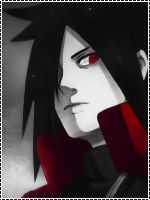
- Joined
- Mar 23, 2011
- Messages
- 2,386
- Reaction score
- 283
Its ok. Kinda weird though.
How so?

- Joined
- Nov 17, 2010
- Messages
- 11,133
- Reaction score
- 580
How so?
Idk much about photoshop stuff (yet) so I can't tell exactly, its just that the blending(Is that what it is?) looks weird imo. I like the text though.

- Joined
- Mar 23, 2011
- Messages
- 2,386
- Reaction score
- 283
u did something to the render and it looks too flat or something
no blending on the upper part of the render and it could use some IMO
and i don't like the text
 why would I blend the upper part it's supposed to stand out cuz it's his head
- Joined
- Nov 14, 2010
- Messages
- 23,222
- Reaction score
- 646
you should have used better render, or if you did something to that render, than it´s bad

- Joined
- Aug 11, 2010
- Messages
- 2,549
- Reaction score
- 1,158
i said that cause the render looks LQ
and it seemed it would be better if u masked it up a bit
- Joined
- Mar 23, 2011
- Messages
- 2,386
- Reaction score
- 283
make some changes and it will look cOoOol...now it looks just OKAY
Such as? You're not helping much unless you tell me where changes should be made.
I might do that...i said that cause the render looks LQ
and it seemed it would be better if u masked it up a bit