[Photoshop] Swirly devil unicorn

Preta

Member
Joined
May 4, 2009
Messages
187
Kin
0💸
Kumi
0💴
Trait Points
0⚔️
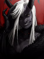
Quick siggy made for someone in the request forum. I hate the frameless style, but that's what he asked for. Anyway, figured I'd post it here for fun.

 
Last edited:

Sin

Active member
Legendary
Joined
Mar 3, 2009
Messages
11,090
Kin
0💸
Kumi
1💴
Trait Points
0⚔️
Awards
The text and the actual thing look like two different things.

I don't think you really should do these kind of signatures. They aren't really something your good at.
 

Preta

Member
Joined
May 4, 2009
Messages
187
Kin
0💸
Kumi
0💴
Trait Points
0⚔️
The text and the actual thing look like two different things.

I don't think you really should do these kind of signatures. They aren't really something your good at.
Oh man! That's a pretty super-serious critique and the facts of it have overwhelmed me!

You're so silly. You're an angry person who is currently angry at me, I get it. You don't need to keep proving it with your nonsense. But don't say such silly things sweetie, it's bad for your complexion.

Here, have a hug. :hug:

And another! :hug:
 

Ali G MPGH

Active member
Regular
Joined
Dec 27, 2009
Messages
991
Kin
0💸
Kumi
0💴
Trait Points
0⚔️
Awards
its good.
Well, it is very different from ur last one, ur last one sucked and this one is gewd.
Can you show us proof that it was made by you?
 

Sin

Active member
Legendary
Joined
Mar 3, 2009
Messages
11,090
Kin
0💸
Kumi
1💴
Trait Points
0⚔️
Awards
Oh man! That's a pretty super-serious critique and the facts of it have overwhelmed me!

You're so silly. You're an angry person who is currently angry at me, I get it. You don't need to keep proving it with your nonsense. But don't say such silly things sweetie, it's bad for your complexion.

Here, have a hug. :hug:

And another! :hug:
I wasn't angry, I was just saying what I think of the signature. I'm just thinking that the text and the signature seem like two different things, and that you shouldn't really do this sort of thing.

:|

This is okay though.
 

Preta

Member
Joined
May 4, 2009
Messages
187
Kin
0💸
Kumi
0💴
Trait Points
0⚔️
its good.
Well, it is very different from ur last one, ur last one sucked and this one is gewd.
Can you show us proof that it was made by you?
Proof? You think I just happened upon a sig that matched exactly what someone was asking for in the request section? o_O

Sheesh, I wish. I even had to cut the render out myself since I couldn't find a good one. =(

I thought it was pretty obvious that my color explosion sig was a joke, I said it was going to be part of the vomiting rainbow collection!<3

Glad you like it though.
 

umar islam

Active member
Regular
Joined
Sep 2, 2010
Messages
643
Kin
0💸
Kumi
0💴
Trait Points
0⚔️
Proof? You think I just happened upon a sig that matched exactly what someone was asking for in the request section? o_O

Sheesh, I wish. I even had to cut the render out myself since I couldn't find a good one. =(

I thought it was pretty obvious that my color explosion sig was a joke, I said it was going to be part of the vomiting rainbow collection!<3

Glad you like it though.
ali is right on his place the sig is awesome but sin is also right. text not fit & it's true.:D
 

MihawK

Active member
Regular
Joined
Dec 30, 2009
Messages
612
Kin
0💸
Kumi
0💴
Trait Points
0⚔️
Awards
Preta goes raging on an innocent person atm lol ? :D

well dude overall i like it, yeah i really do the only thing that distracts me from "TOTALLY LOVING" it is the coccoon he's sitting in and the hand coming out of his ass :/
 

Typhon

Active member
Legendary
Joined
Apr 29, 2009
Messages
15,991
Kin
664💸
Kumi
6,684💴
Trait Points
0⚔️
Pretty good. I agree with some of the others that the text doesn't really match. And as MihawK said, the "cocoon" he is sitting in could have been made better. The hand coming out near the top appears to be reaching for Constatine, which looks great, but that other hand coming out of the bottom looks lost. I think it would also be better if the cocoon wasn't so solid/bordered (prob not the right word :p).
 

MentalJerk

Active member
Legendary
Joined
Jul 18, 2008
Messages
12,286
Kin
0💸
Kumi
0💴
Trait Points
0⚔️
Awards
Noice! Though text doesn't blend very well with the work. And this seemed to be an attempt to make a bg-less work. If it was, then you should've re-moved the white bg. That thing is in PNG.


I don't think you really should do these kind of signatures. They aren't really something your good at.
I don't think you really should do these kind of critiques. They're aren't really something you're good at.


Srsly, if you seek to be a pro at something "GFX in this case" then keep in mind that GFX itself isn't the only thing you should improve at. Your criticism should also be more supportive and tolerable to other GFXers. I'm seriously disappointed to see such post from someone with a level as yours.
 

Preta

Member
Joined
May 4, 2009
Messages
187
Kin
0💸
Kumi
0💴
Trait Points
0⚔️
Preta goes raging on an innocent person atm lol ? :D

well dude overall i like it, yeah i really do the only thing that distracts me from "TOTALLY LOVING" it is the coccoon he's sitting in and the hand coming out of his ass :/
Yeah, that hand in the back bothered me as well. But it came down to more of a concept versus design issue. The concept was kind of hell crawling out of, and trying to pull him into, itself. So I decided to leave the hand to further signify that.

Admit it, you TOTALLY LOVE it! :hug:

O_O
I want to try this, Would you mind if i ask you its PSD?
I don't really ever give out psd's for my work, and in the case of this sig, all of the niceties come from decisive filtering/cutting/adjusting, so the psd would not be of much help to you unless it came with a guide as to what was done to each layer. This was actually a pretty simple sig for me to make as far as layers go, so I might do a tut for you. =)

And this seemed to be an attempt to make a bg-less work. If it was, then you should've re-moved the white bg. That thing is in PNG.
Thanks.<3

It was not an attempt at a bg-less work, it was a bg-less work. I simply saved it onto its white bg because the forum has a white bg, and so it would still appear bgless to anyone who sees it. To save it on transparent would have required lots of incremental saving and merging to avoid any glows or artifacts and since it would look the same either way -- I was feeling lazy. O.OO.O

Edit: Blah! You made me feel like such a cheater that I uploaded a transparent version instead. I hope you're happy! =(
 
Last edited:

Grim

Active member
Veteran
Joined
Feb 17, 2010
Messages
4,493
Kin
1💸
Kumi
0💴
Trait Points
0⚔️
Awards
everything i wanted to say have been said and answered, so amm it's cool BUT... not much of a signature... more of a rebuilt render... looks unfinished or finished in wrong diraction
 
Top