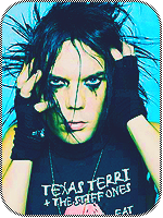
Awards
You must be registered for see images
Please rate and critique and stuff. Also I'd like if you gave actual constructive criticism instead of a standard "i like it" type post.


Sorry, my bad. :/2. It looks like someone jizzed on the render. O_O
Thanks for the CnC. Tags have never been my strong point anyway, and I should really learn how to use C4D's and textures better.This is a very nice piece but there is some points that may only seem personal to me but
It looks a bit messy and there is no really understanding of what you were wanting this signature to be. Most signatures need to have a plot for a true understanding and I haven't even mastered this. The splatters could have been used with some clipping masks and maybe you could have changed the colours to make it different?
It also seemed like you smudged a lot but there is no.. real background it looks like Grovyle is stuck to a green wall and shooting out white things.
This was trying to be more professionally considering I don't know you or your work that well so I was giving it on a basis of being more informational than normal.
8.5/10


Its okay, can't blame you. I can tell just by looking at that Grovyle's face she wanted it. Those eyes just scream *****. xdSorry, my bad. :/
Couple things I dislike.
1. The unused space on the sides. It takes up about a 1/3 of the sig with nothing but open space.
2. It looks like someone jizzed on the render. O_O
HAAHIts okay, can't blame you. I can tell just by looking at that Grovyle's face she wanted it. Those eyes just scream *****. xd
 !
!